Striim is a real-time data integration and analysis platform. Health Monitor is the tool that helps customers monitor the status of all their assets in the cluster, including applications, memory, CPU and etc. The goal of this project is to update the current Health Monitor to the new UI infrastructure, improve user experience and expand functionalities. I worked closely with the shareholders, PMs and engineers to understand the business goal and identify the usability problems. I was deeply involved in the entire process and designed the product from the initial user studies to high-fidelity mockups.
The biggest challenge of this project is to understand the information architecture. Striim is an enterprise software company with very tech-heavy products. Health Monitor is apparently the most complicated one since it covers almost everything in the system. Although this was not the first Striim’s product I worked on, there are still a lot of stuffs I need to learn. In order to design a better user experience, I have to at least have a high level of understanding of the entire system.
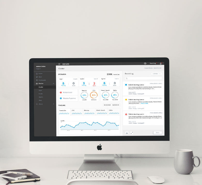
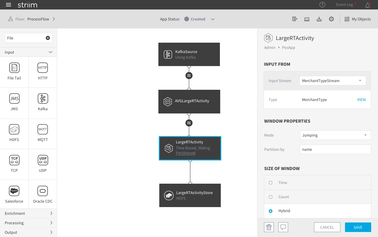
Previous Flow Designer
When I started working on this project, I took a very different design path: instead of focusing on style, flow and interaction, the first thing I did was to get familiar with every component in the current Health Monitor. I extracted all the objects within the system and tried to understand their properties and how they are related to each other.
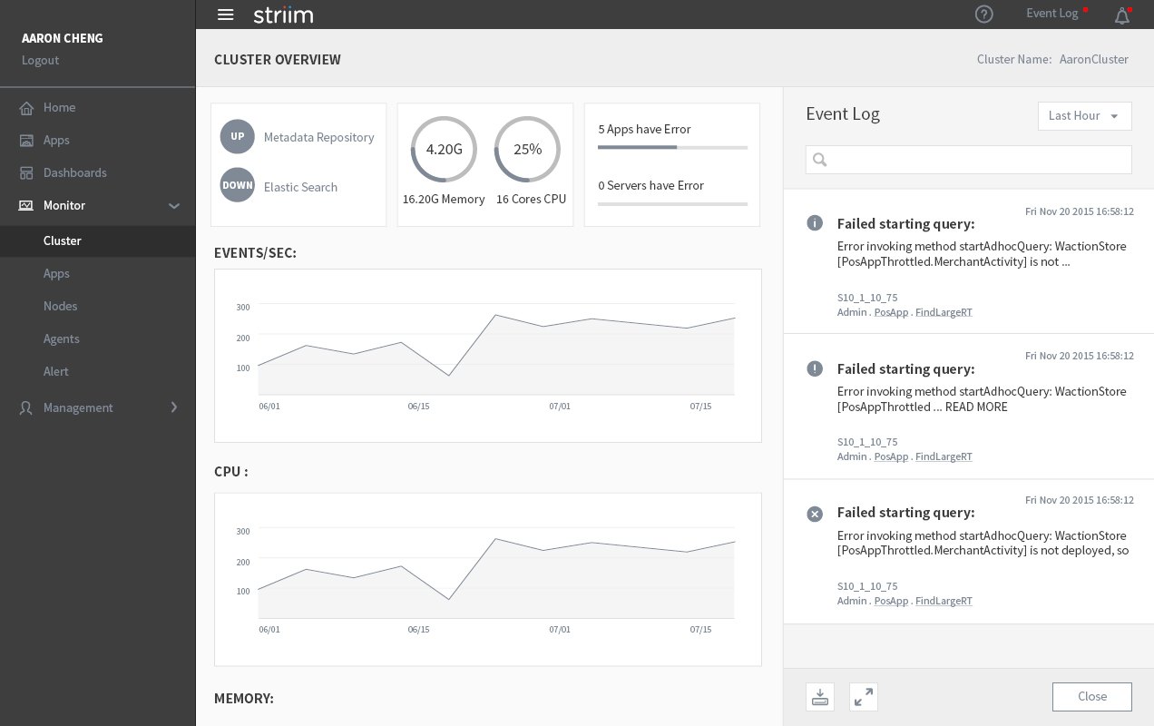
Overview Section
Detail Section
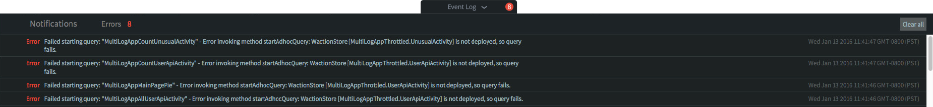
Event Log
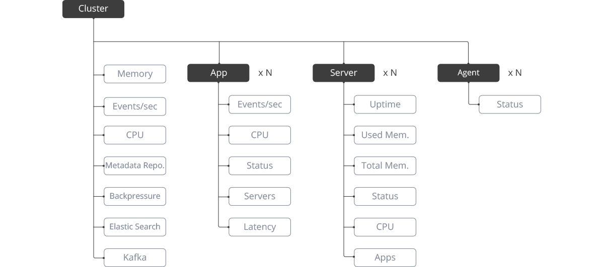
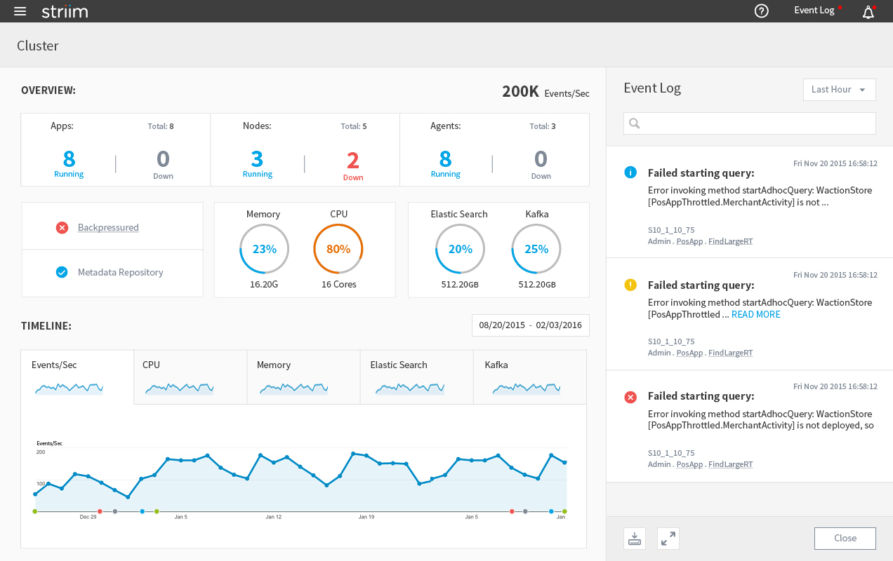
There are three sections in the current UI: the overview, the detail information of all the components and the event log. The event log is not part of the information architecture, so we can put it aside for now. The overview section is pretty straightforward, which shows the status of the entire cluster, including throughput, memory and uptime. The detail section is somewhat confusing, (e.g. why are there two exact the same lists?) But at least I was still able to figure out there are three types of components inside the cluster: app, server and node, and each has different parameters we want to monitor. Then I made a diagram of the current product’s information architecture.
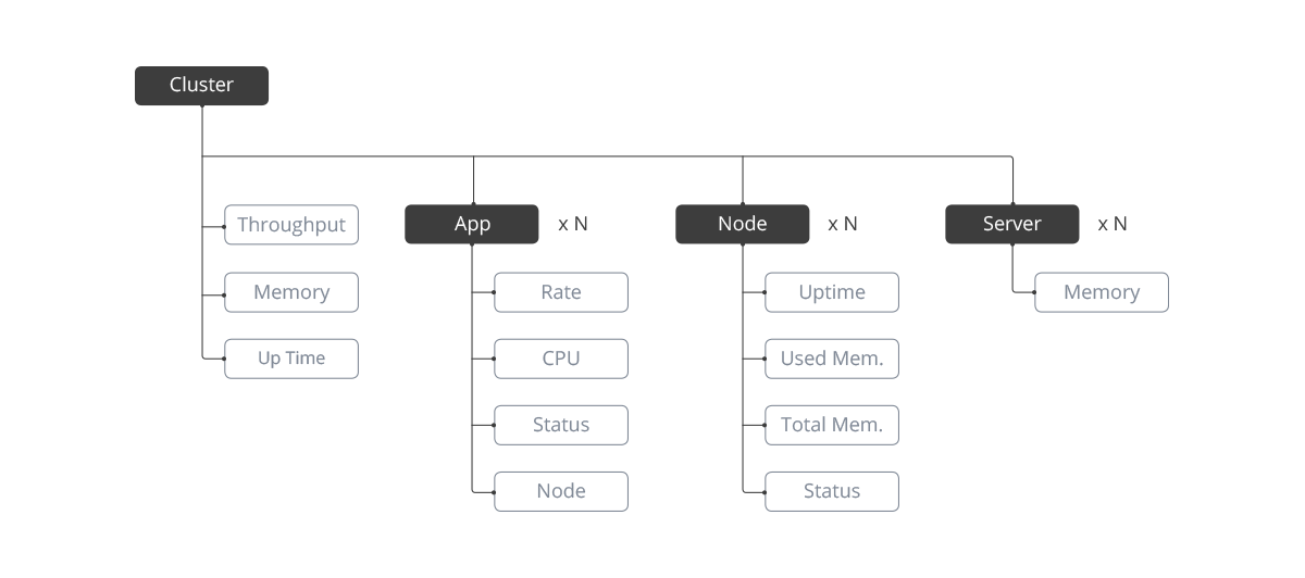
Existing Information Architecture
From the diagram, I noticed some issues with the current product:
I consolidated the questions I have found and discussed them with the PMs and engineers to redefine the requirements for this product, including what metrics we need to show and how we want to show those metrics. (Some answers I got from the discussion are quite surprising: the Server and Node are the same thing, they are built by two different teams and they called them differently.) In the next step, I updated the diagram to better represent the actual information architecture of the system. At that moment, I felt I had enough knowledge about the platform and it was time to go back to work on the user experience. Before I started designing anything, I decided to do some user testing to see how the users are reacting to the current product.
We invited several users to test the health monitor and we observed how they interacted with the product and asked them to think loud during the interview. We got some valuable feedback from both the design perspective and the information architecture perspective. Some users even asked the same questions I had in my previous study.
Based on the feedback we got from the user testing and the discussion we had earlier, I updated the information architecture diagram.
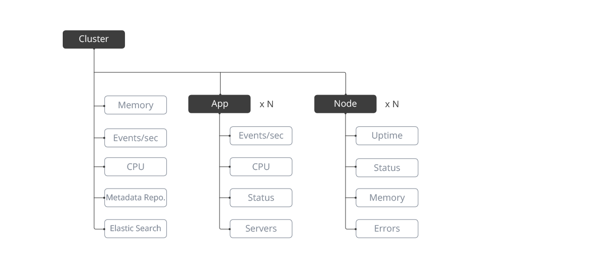
Updated Information Architecture
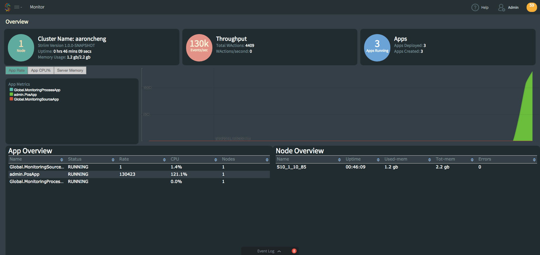
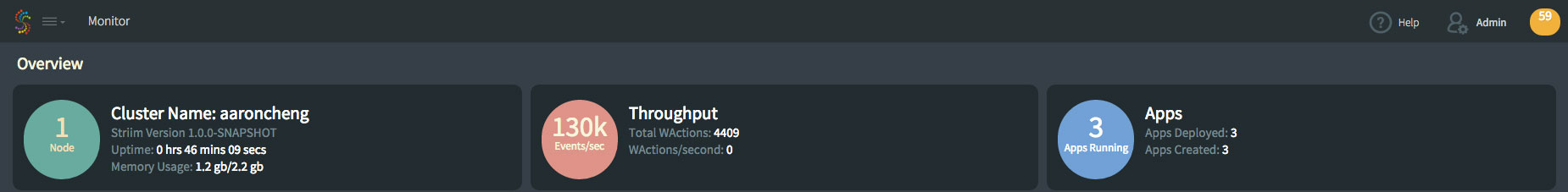
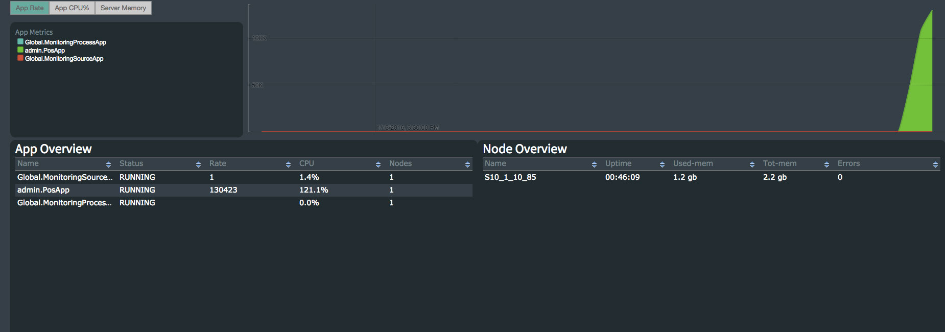
Now it’s the time to work on the design. The first thing I did was to figure out a way to better display the event log. Event log is essentially a notification system. Usually the notification button is on the top right corner on the navigation bar for most of the web applications. So I moved it there from the bottom of the screen to match the UI pattern that everyone is familiar with. To solve the readability issue, I decided to move it to the right side panel to reduce the width, which also works perfectly with Striim’s new UI infrastructure. The next step was to reorganize the layout and add some key metrics required by the clients. The new design still has 2 sections: the overview section and the detail section. In the overview section, I grouped items that have similar properties or visual style. In the detail section, instead of showing 2 identical lists, I only kept the one with the parameters. If one of the items is selected, the timeline chart will show up right next to the list. Users can also toggle between ‘CPU�?and ‘Throughput�?for Apps and ‘CPU�?and ‘Memory�?for Nodes.
Wireframe
Striim's Current UI infrastructure
We built a simple prototype based on the wireframe and showed it to several clients. We got much better feedback but there were still some problems. The most critical one is it is too crowded to put the list and the chart side by side. Plus, some clients told us they had over 100 apps in their cluster, which is hard to be displayed on one page. To solve this problem, I added the submenus for Apps, Nodes and other settings under Health Monitor. Then all the lists can be moved to its own page and the Health Monitor’s landing page will only show the overall metrics and charts.
Updated Wireframe
In this round of user testing, most of our customers felt the latest design was easy to use and it was clear to find the status of every component in the cluster. But they still wanted to add more metrics to the cluster’s dashboard, including Agents, which are special Apps provided by the third parties. So we updated the information architecture diagram again and finalized the components and metrics we wanted to show in the Health Monitor. Also, while we were watching the customers using our product, we noticed if they want to see the timeline of Kafka usage, they would have to scroll all the way to the bottom of the page.
Final Information Architecture
We built a simple prototype based on the wireframe and showed it to several clients. We got much better feedback but there were still some problems. The most critical one is it is too crowded to put the list and the chart side by side. Plus, some clients told us they had over 100 apps in their cluster, which is hard to be displayed on one page. To solve this problem, I added the submenus for Apps, Nodes and other settings under Health Monitor. Then all the lists can be moved to its own page and the Health Monitor’s landing page will only show the overall metrics and charts.
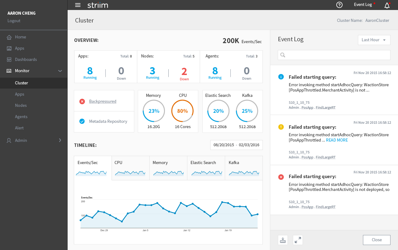
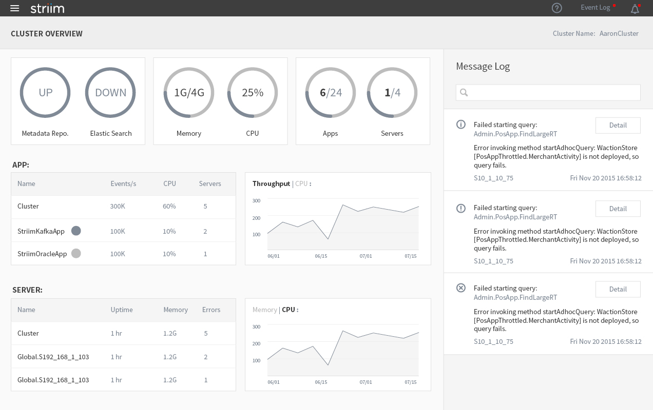
Health Monitor Cluster
The navigation panel on the left side can be closed to give more space to the content in the middle. So is the Event Log on the right side.
Health Monitor With Navigation Panel Hidden
All the apps are now on a separate page, which can be accessed from the navigation panel. On the top of the page, there are 2 charts showing the timeline of the overall throughput and CPU usage.
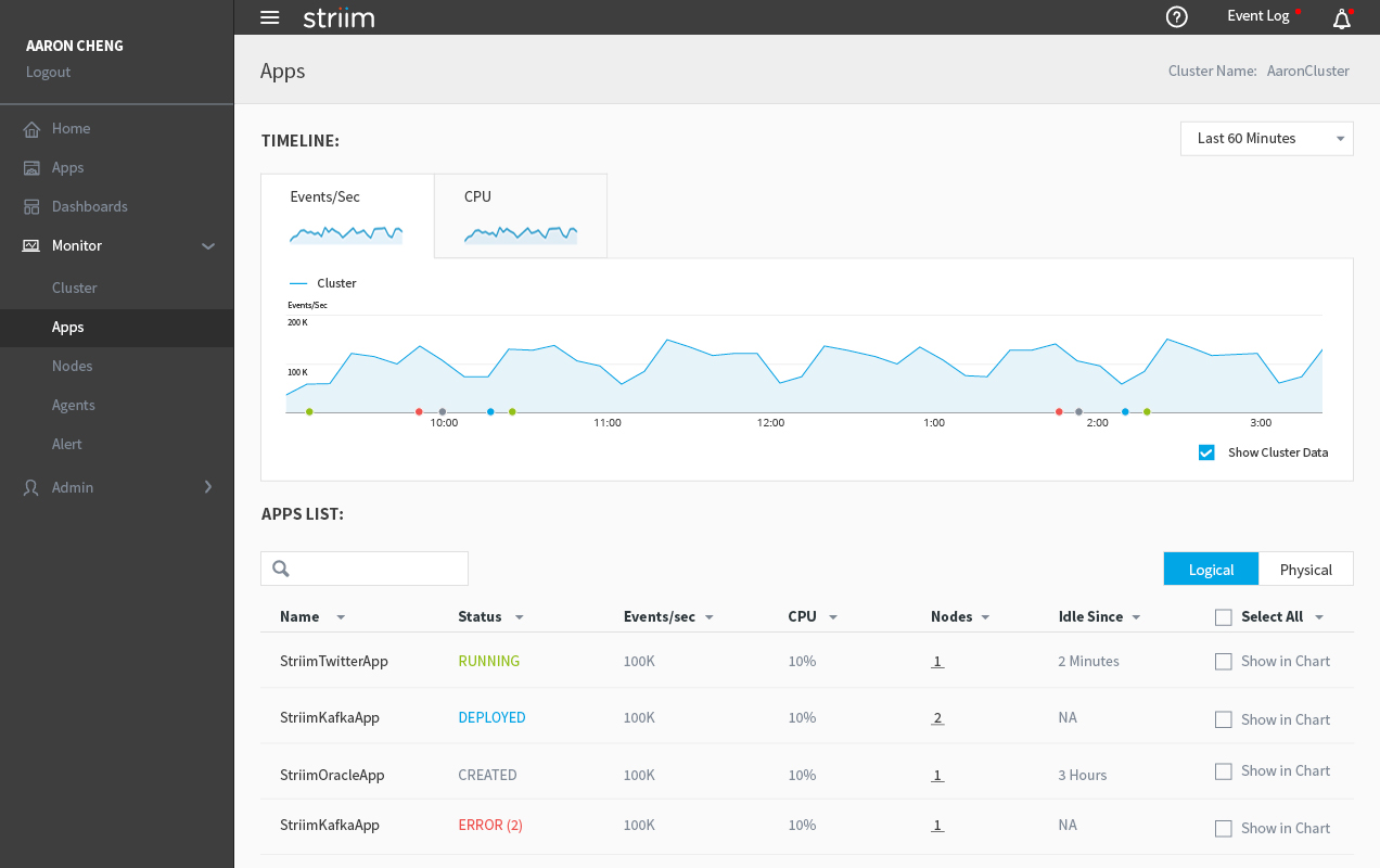
Health Monitor - Apps
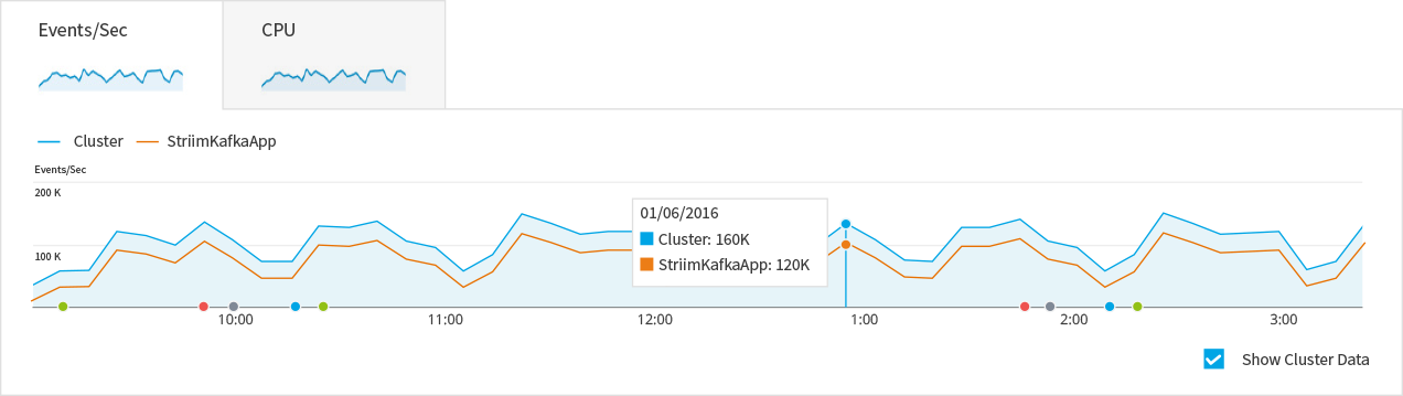
If users check the ‘Show in chart�?box next to each app, the app’s throughput and CPU usage will be added to the chart and users will be able to compare the app with the cluster or other apps.
Health Monitor - Apps
The node page has the same layout as the app page, except for physical/logical options.
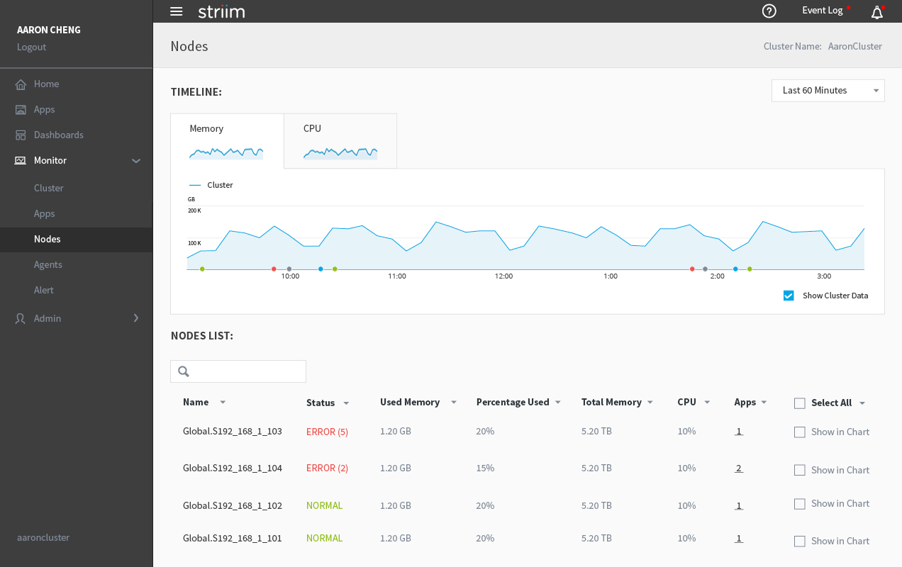
Health Monitor - Nodes