Flow designer is one of Striim’s core products. It allows users building data pipeline to ingest high-speed streaming data from a wide variety of sources and deliver it to many different types of systems. I joined as the lead designer when the company was rebranding its entire product. The goal of this project is to improve the overall user experience of the flow designer and define the new UI infrastructure to accommodate all the current and future products, and deliver simple and consistent user experience across the entire platform.
Flow designer is the first project I worked on after I joined Striim and also my first enterprise software design. I have to learn a lot of big data related concepts and understand all Striim’s products. However, I really enjoyed this challenging yet interesting task and would like to share my design process with you.
Previous Flow Designer
New Flow Designer
Many UX designers tend to begin the design by storyboarding a critical user path and one interaction flow will lead to the design of another interaction flow. After they have all the flows, the next step is to define the layout, navigation, color scheme and etc. But the problem is while working on a single flow, we can’t see the big picture of the entire system and how various objects relate to one another. So when I started working on the Flow Designer, instead of diving directly to the actual design, I worked with the PMs and engineers to create an object map showing all the objects with their actions and nest objects. This map tells 3 things about the system: What objects are in the product? What can each object do? How does each object relate to other objects?
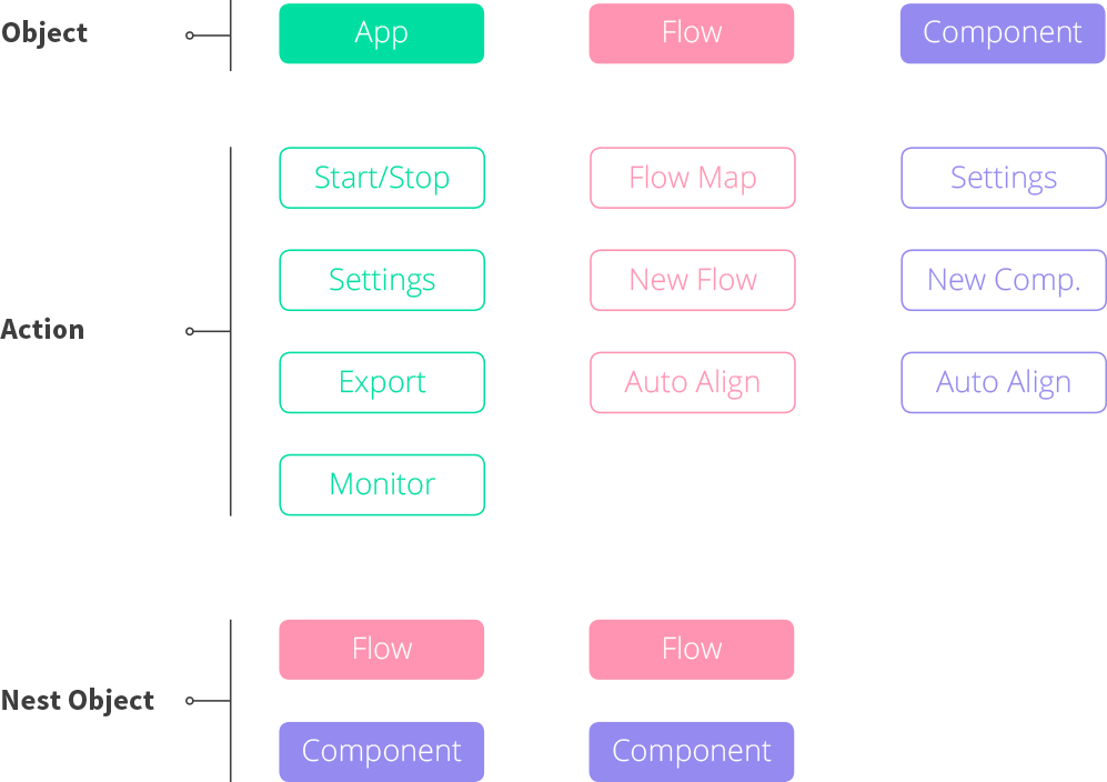
An object map showing objects with their actions & nest objects
The next step is to prioritize the objects and actions. There are three types of objects in Flow Designer: App, Flow, and Component. Component is the base unit of a data pipeline and editing components is the most important interaction in Flow designer. Flow is simply a collection of Components, which is the least important object in the system. App is the data pipeline composed of multiple flows and components. App has only global actions that have no direct impact to the components, so together with Flow, we can consider them as the secondary interactions. The reordered object map can help me make design decisions when I design the Flow Designer.
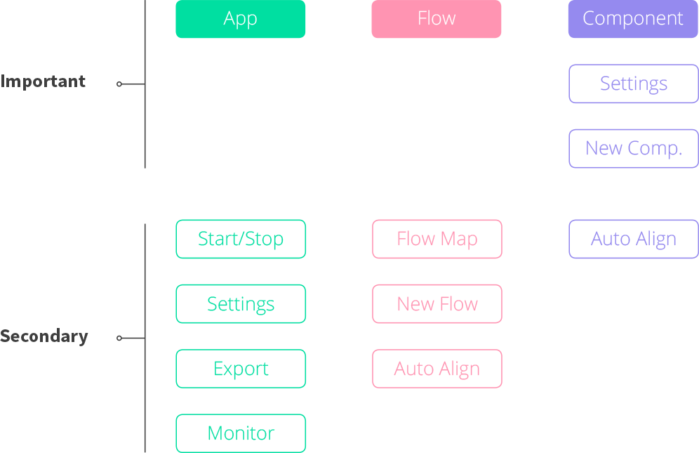
Reordered based on how important each element is.
Now I have a better understanding of the system and it is the time to design the UI. However, since the new UI will be used for not only the Flow Designer but also other Striim products, I need to study all the existing interfaces/interactions and define a consistent UI architecture across the entire platform. Let’s take a break from the Flow Designer for awhile.
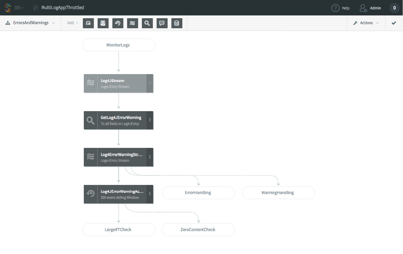
Flow Designer (Previous design)
Dashboard (Previous design)
Health Monitor (Previous design)
Management (Previous design)
Striim has 4 major products: Flow Designer, Dashboard, Health Monitor and Management. The existing products still have many things to improve, but they give me some rough ideas about the functionality and the possible interactions/interfaces I can expect. Based on the research, I was able to create the modularized UI architecture and define the usage and style for each module.
Define the usage of each module style.
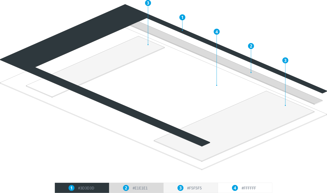
Define the style of each module style: Smaller number has darker color and higher elevation.
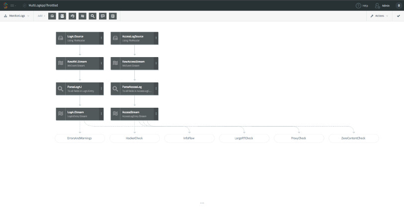
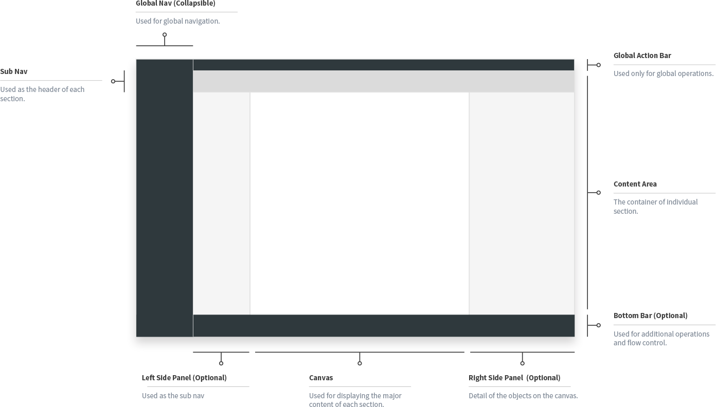
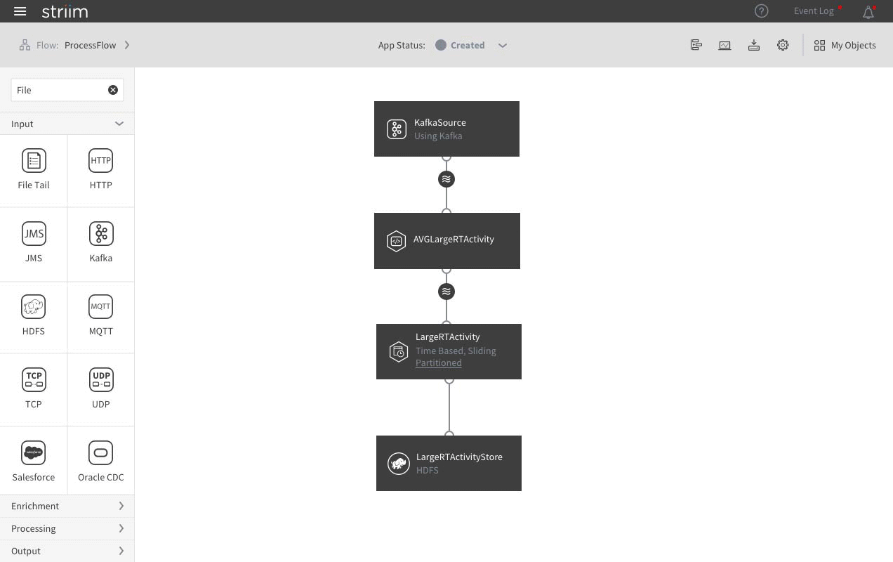
The final step is to bind all the objects to the new UI architecture. All the flows and components are placed at the center of the canvas. The left tool bar lists the component icons, which can be dragged and dropped on the canvas to create new components. The right side panel shows the detail info of the selected component.
Important interactions are placed in the center of the page.
All the secondary interactions are placed on the sub nav bar. Start/Stop is the most important action to an App, so it is centered in the sub nav bar. All other objects/actions are placed on the right side except for the flow map, which has relatively complicated settings and thus is positioned on the left side.
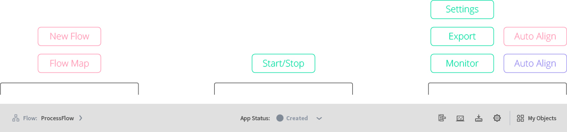
Secondary interactions are place on the sub nav bar.
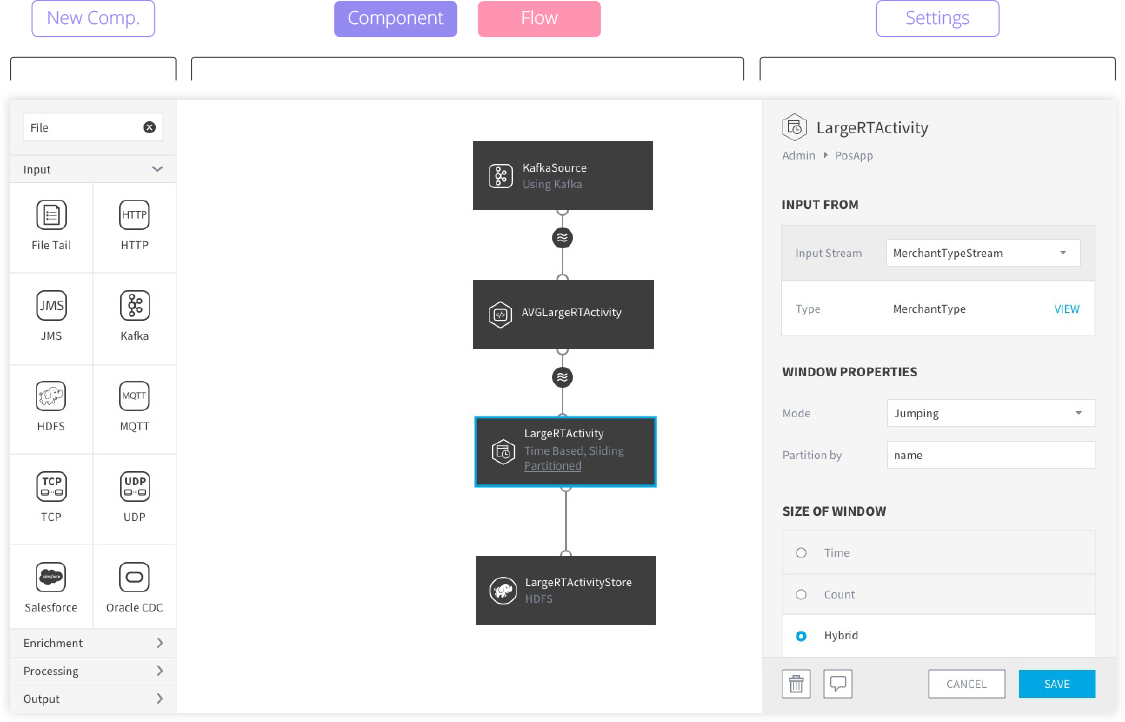
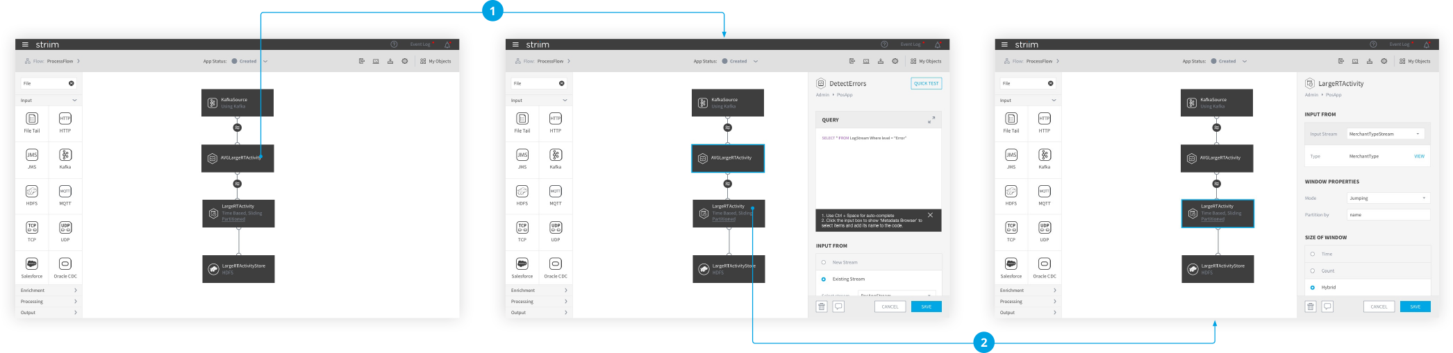
How the side panel works
Editing components is the most important as well as the most frequent interaction. The problem of the previous design is: the component’s settings are in a popover. In order for the users to edit another component, they have to close current popover first and then click another component. To solve this problem, in the new design, the popover is replaced by the side panel. If users want to edit a different component, they can simply click that component and the content in the side panel will change accordingly. Moreover, since the side panel only takes a small portion of the screen, users can still see the overall data pipeline while they are editing an individual component.
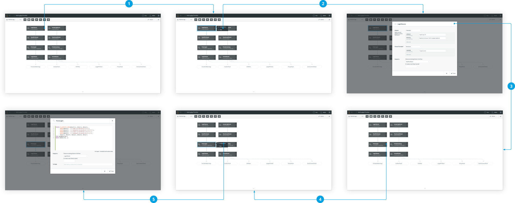
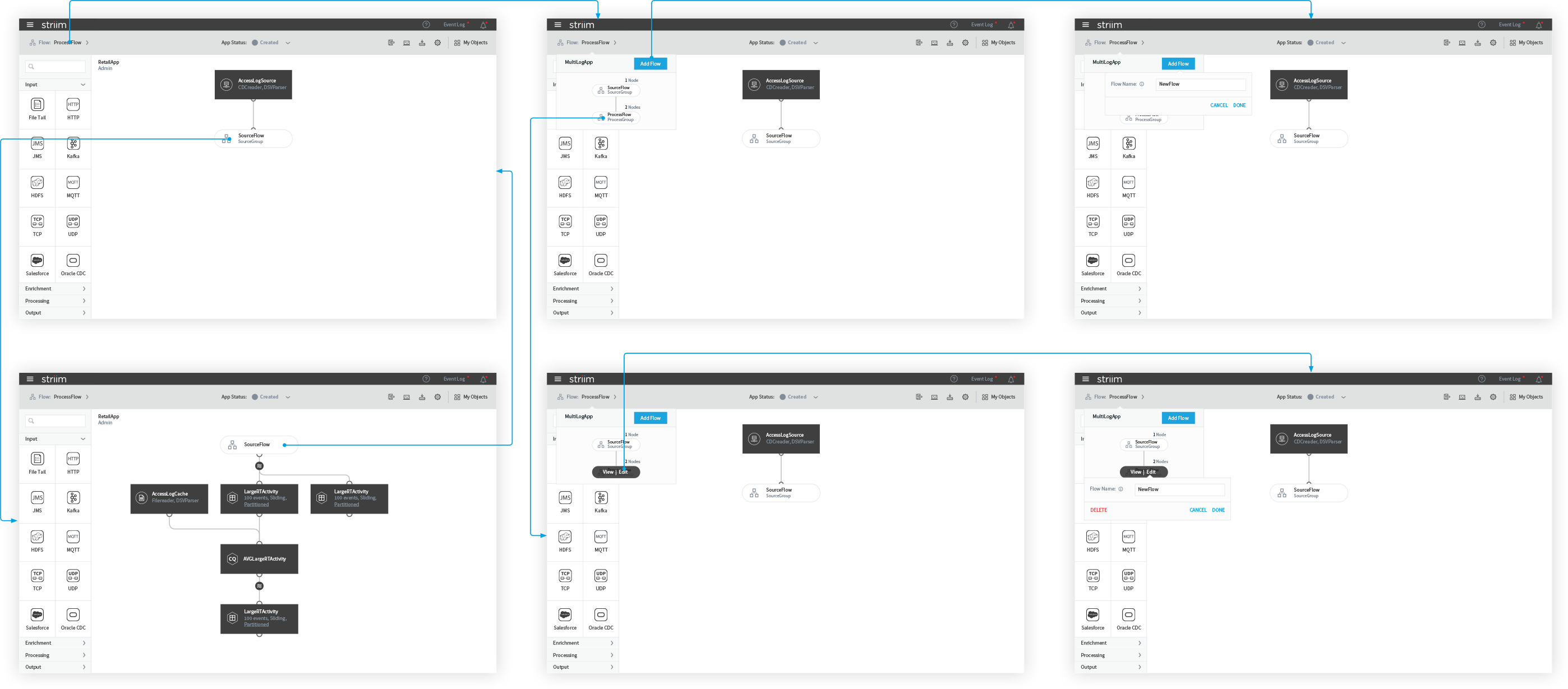
In previous design, It takes 5 steps to edit 2 components.
In the new design, It takes only 2 steps to edit 2 components.
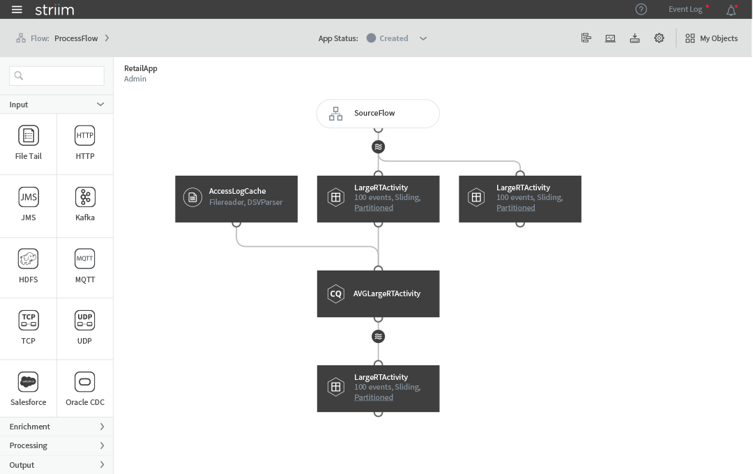
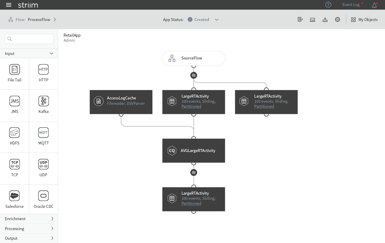
Undeployed status
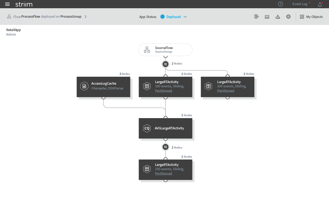
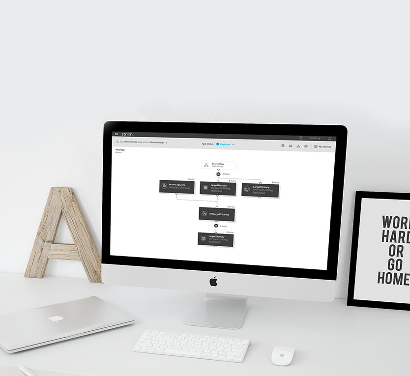
Deployed status
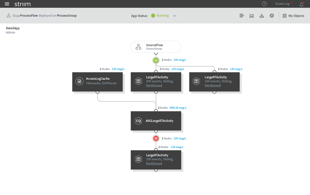
Running status
The flow chart of Flow