Chinese shoppers spent $10 billion in 2015 through cross-border e-commerce according to a report from Chinese research firm Analysys international and web-only retailer JD.com Inc. However, the shopping experience is awkward and difficult. Bieyang is founded with the vision to solve this problem. I joined the company as the 2nd employee and started the project with literally nothing: no product, no funding and no office. I worked closely with the founders and PMs, defining product goals and key features. As the only designer in the team, I designed not only the entire app from wireframe to high-fidelity mockup, but also the company’s overall branding, logo and marketing website. I grew with the company from zero asset to 2 million seed round funding and 2000 daily active users. Note: The original app is in Chinese, all images on this page are translated to English for illustration purpose only.
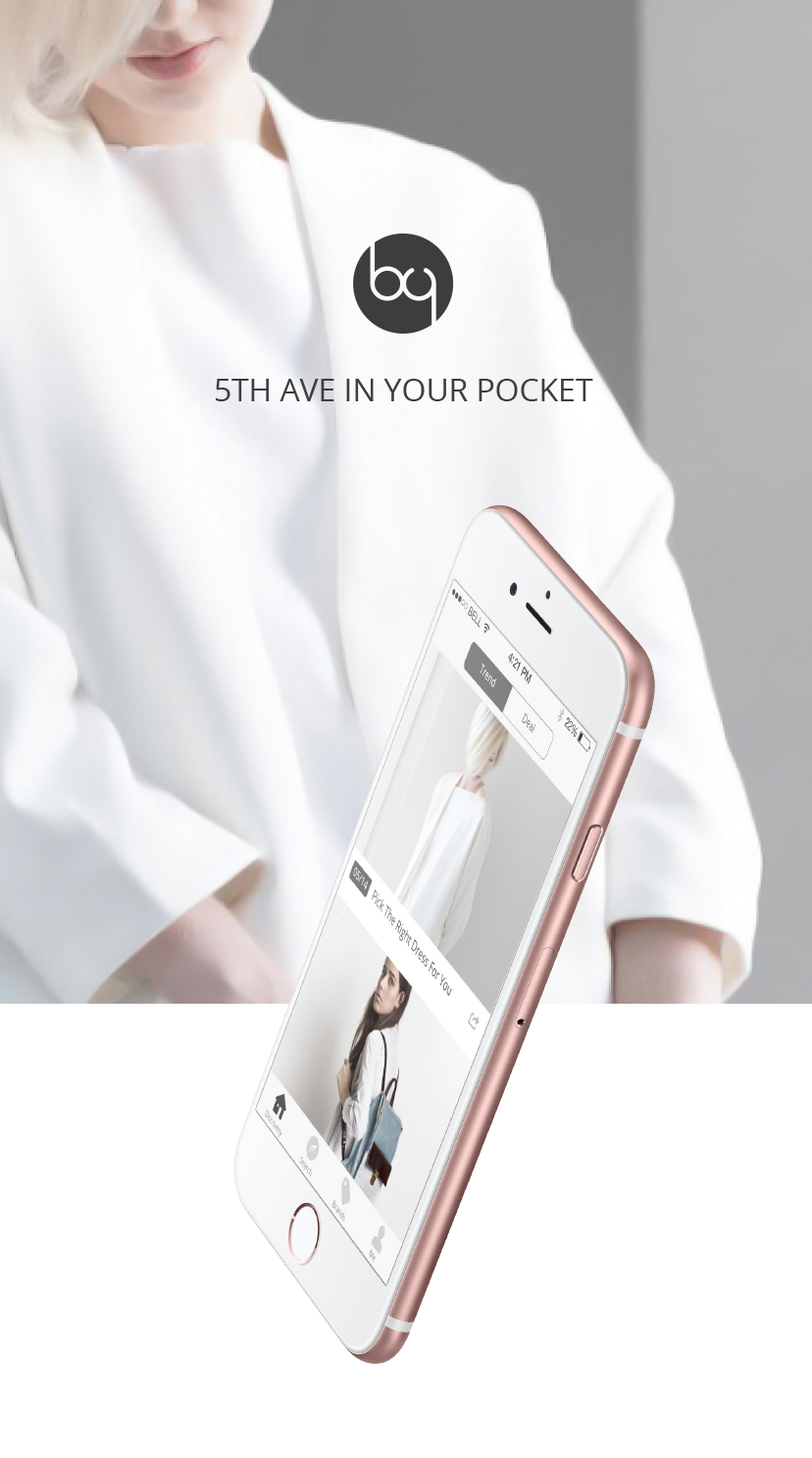
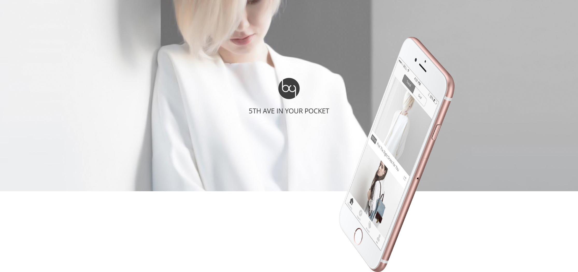
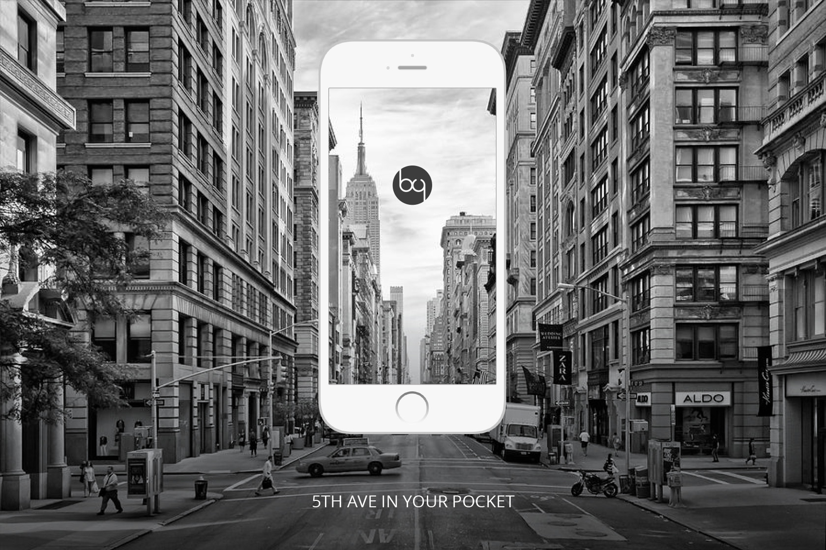
Bieyang is an iOS app, which provides Chinese shoppers a platform that integrates with different merchants in U.S.. Users can enjoy the one-stop shopping experience from their favorite brands and Bieyang will handle everything behind the scene, including payment and shipping.
Discovery
Product List
Brands
Shopping Bag
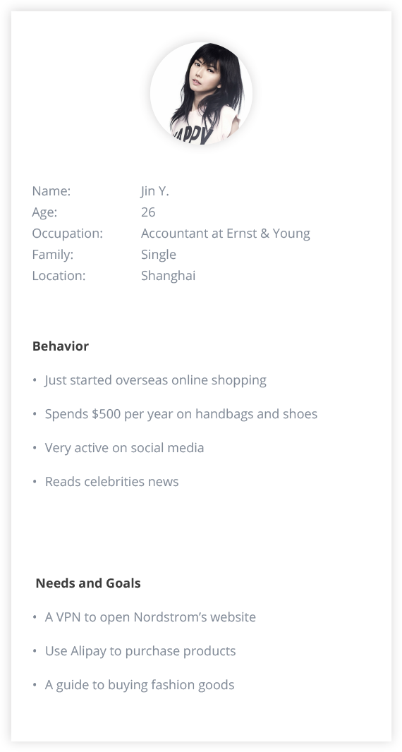
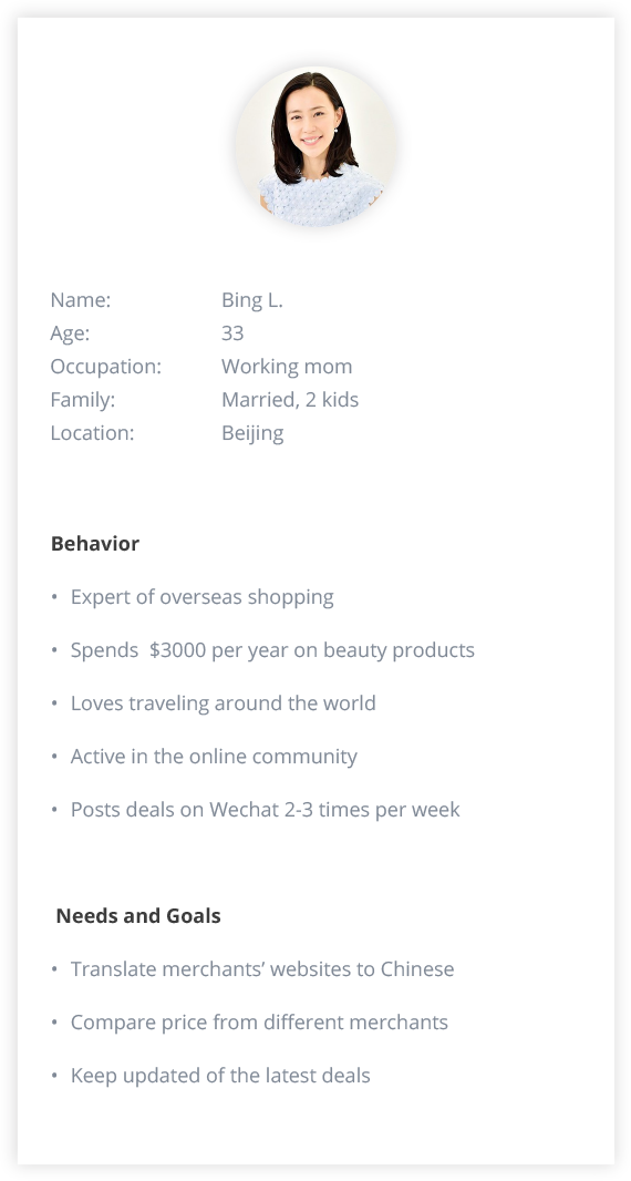
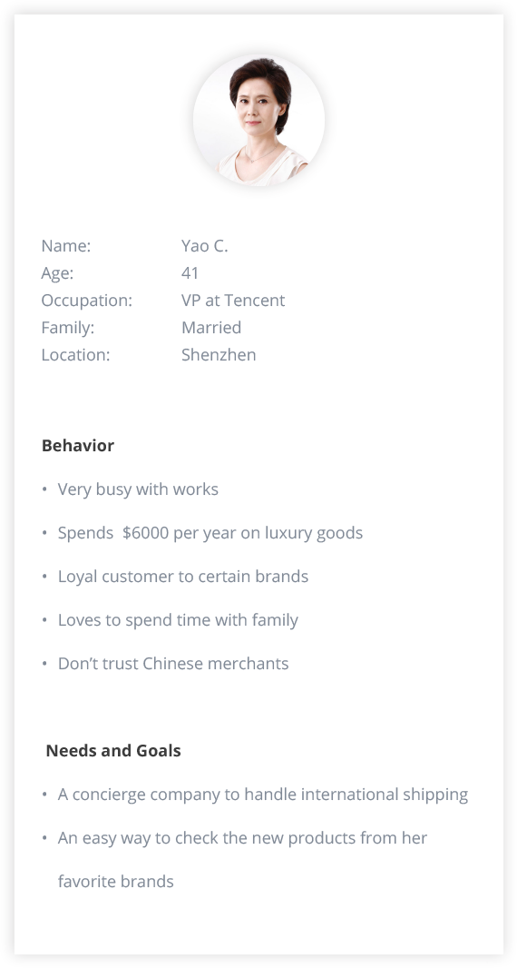
Chinese shoppers spent $10 billion in 2015 through cross-border e-commerce and it has become the market with huge potential. But how can we find the niche market and what can we do to help our potential users? To answer those questions, we interviewed many people with the overseas online shopping experience and came up with 3 personas representing 3 types of users. Our goal for creating these personas was to build an empathy for our users, which lays the foundation for building the product completely focused on solving the users�?problems.
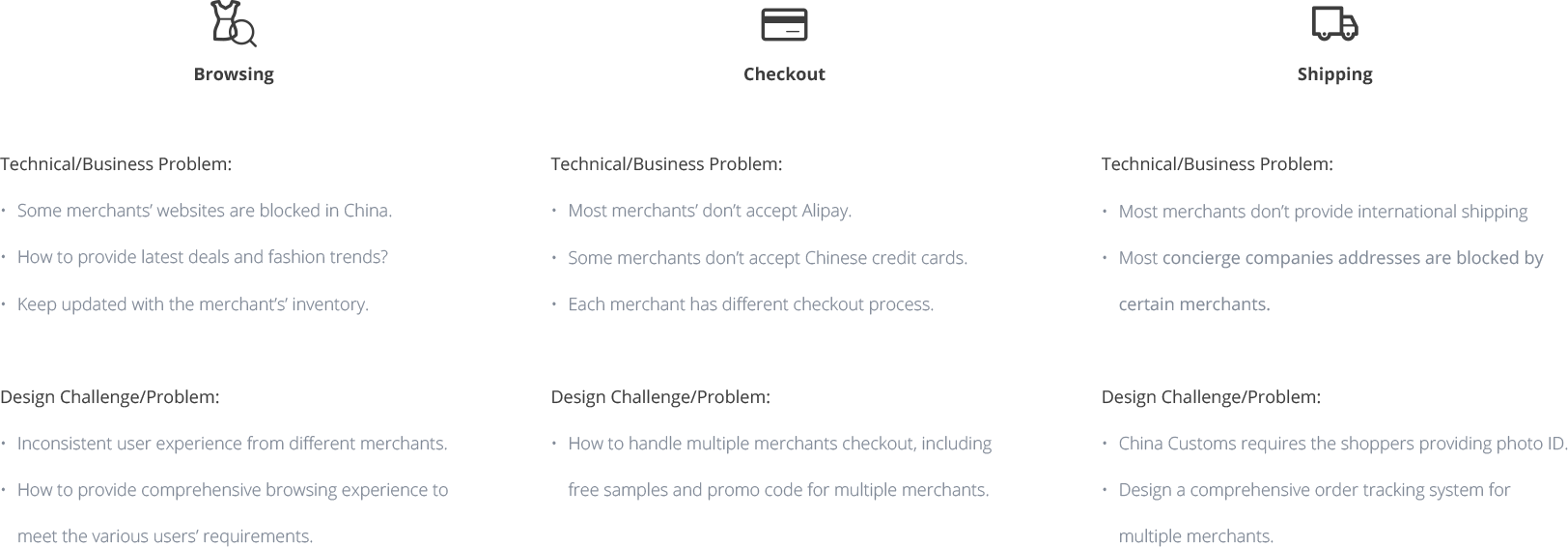
With the help of the personas we created, we were able to identify our users�?pain points at each stage of the overseas online shopping process: browsing, checkout and shipping. Some of the problems are technical or business related and others are design challenges:
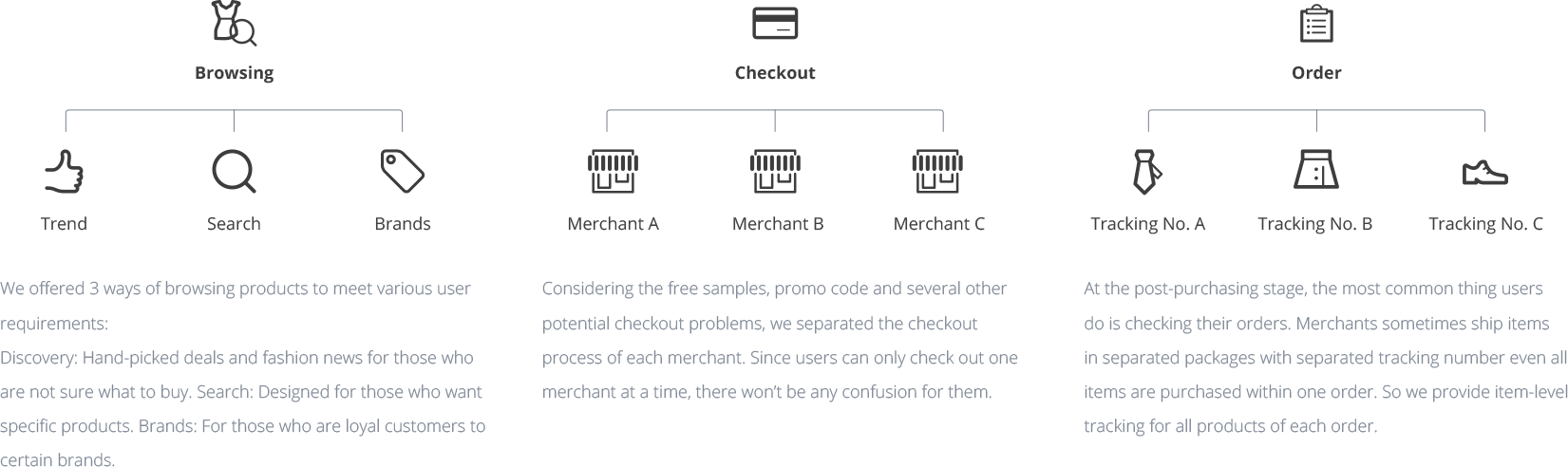
For the technical/business problems, the solutions are straight forward: We crawled every product from each merchant and used bots to automate the purchasing process so the users will always use one consistent interface to purchase from any merchant. We also got partnered with some concierge companies to handle the shipping. For the design problems, I categorized the solutions based on the 3 major stages during the shopping process: browsing, checkout and tracking orders. The diagram below shows the high-level sitemap of the product’s structure and strategy.
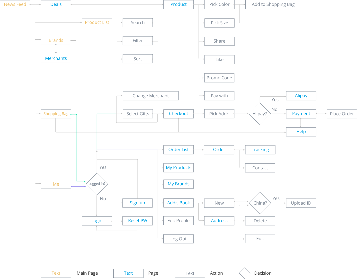
With the sitemap, the next step is to create the user flows, which helps the team understand how exactly the app will fulfill the multiple user objectives and what pages/features need to be designed/built. With the user flow, I can design the UI architecture with consistent user interface and reusable components to accommodate various features.
Most of the items our users purchased are luxury fashion goods. The app’s overall black and white tone as well as the minimalist design style brings a high-end look and feel. The graphics of the logo design is the modification of ‘b�?and ‘y�? which are the first letters of the app name - ‘bie yang�?
Branding Design
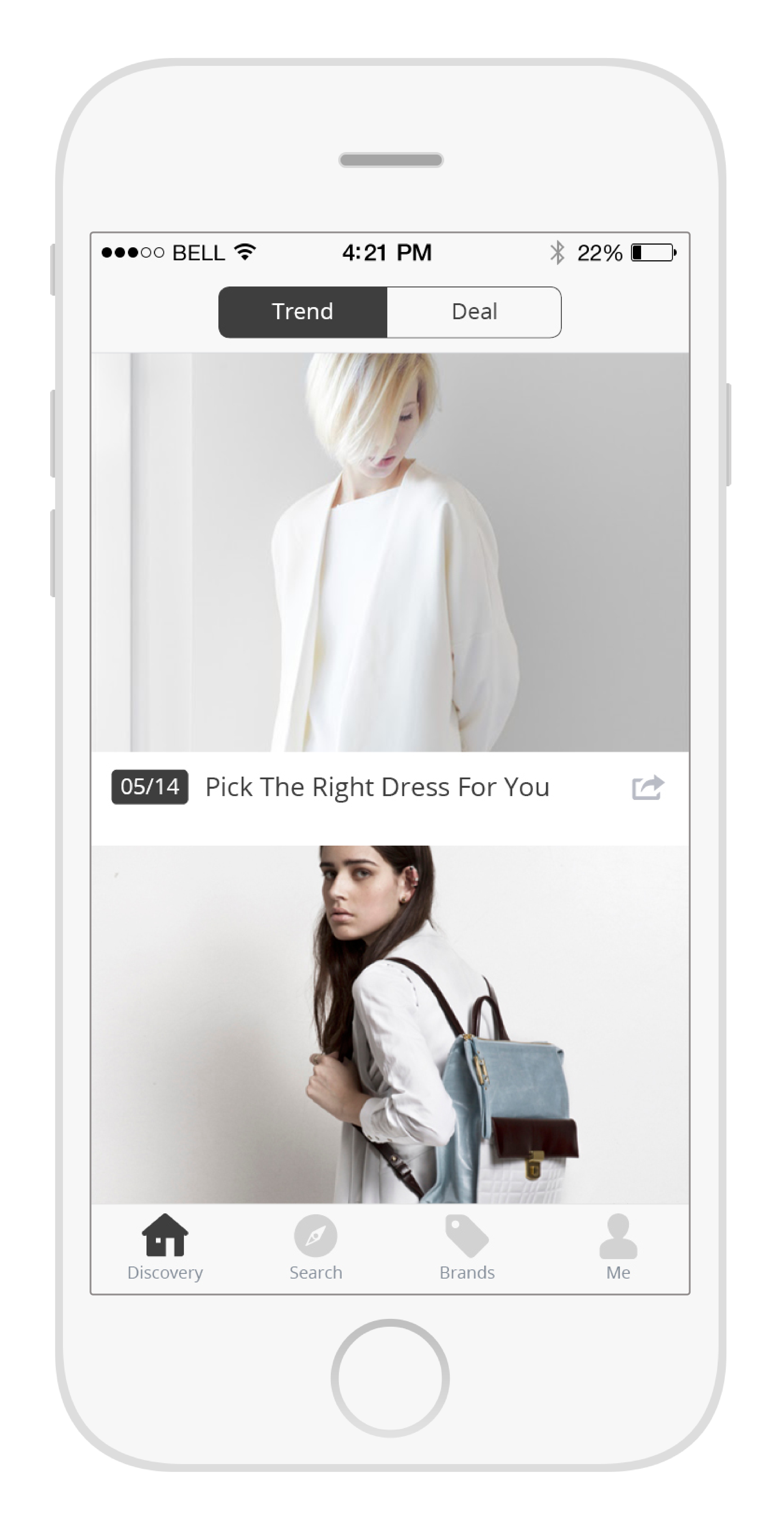
The 2 sections in the Discovery page: Trend and Deal, are designed for those who are not sure what exactly to buy. Trend has the original articles about the latest fashion news or the introduction of new products. Full-width image layout helps arouse users�?interest therefore making purchasing decision. As for the Deal section, since deals refresh frequently everyday, I make the layout denser to accommodate more contents.
Trend
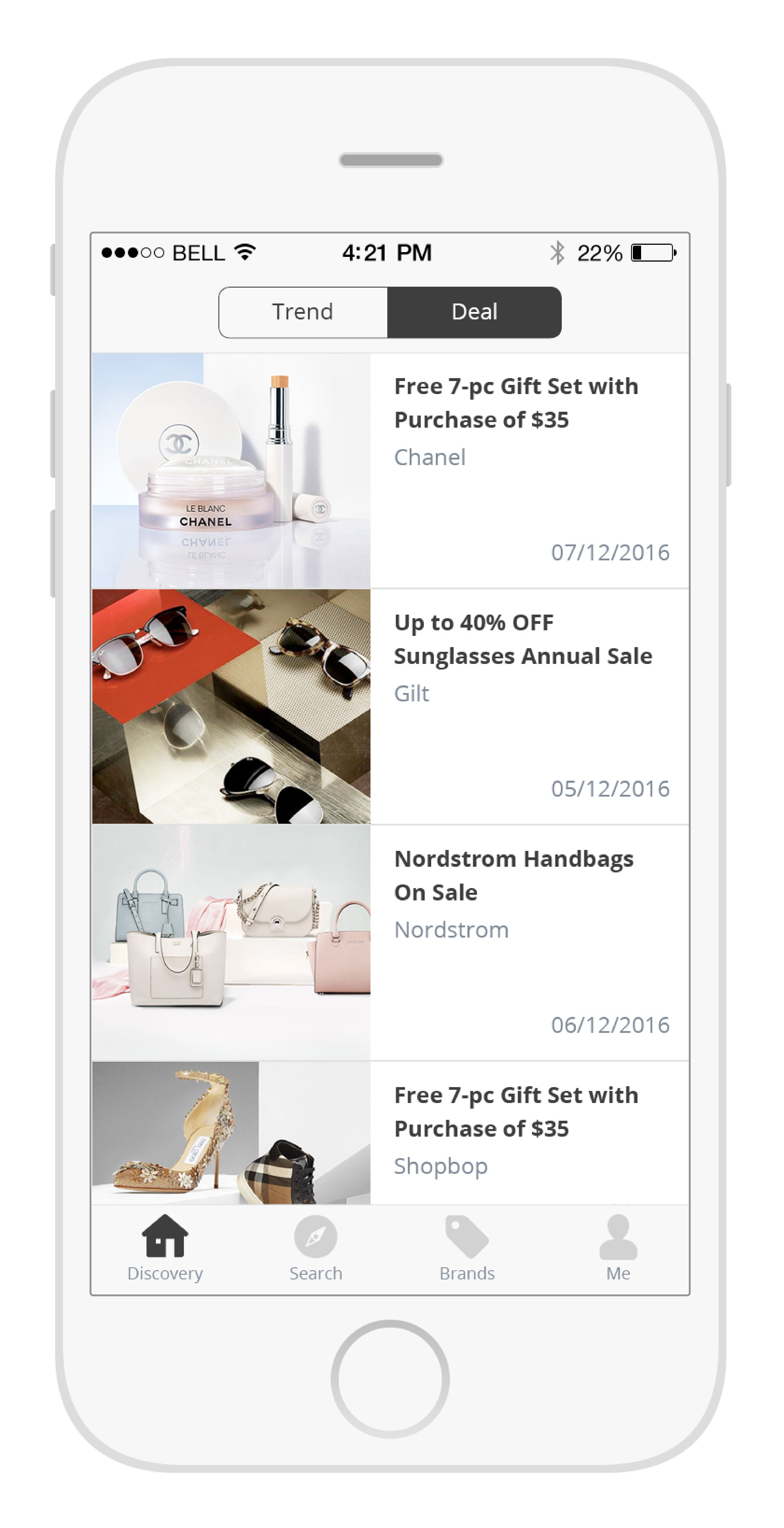
Deal
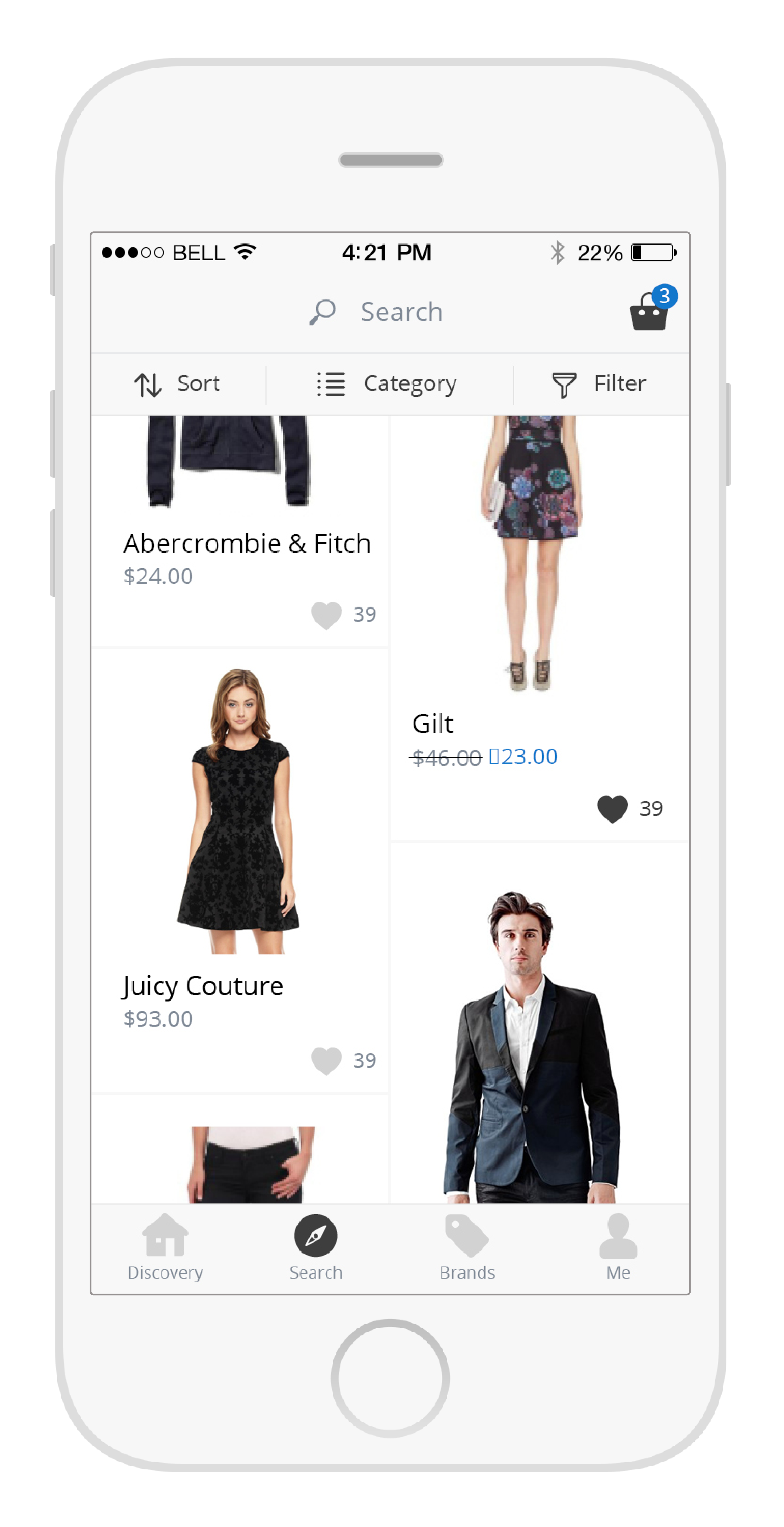
As what its name implies, Search tab is for those who know what they want. Besides search function, this page also provides Sort and comprehensive Filters including merchants, brands, price and discount to help users easily find the items.
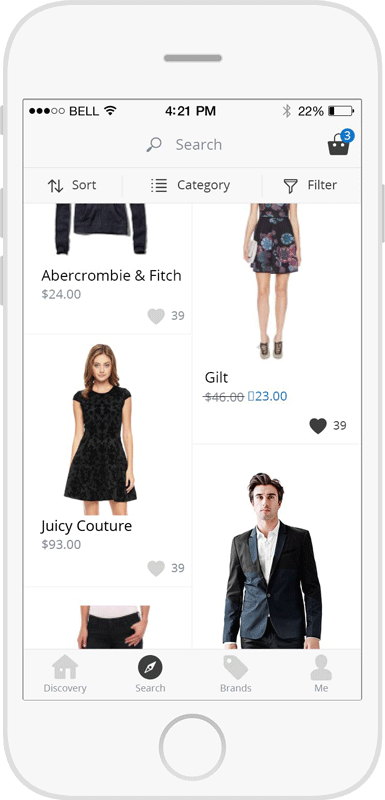
Product List
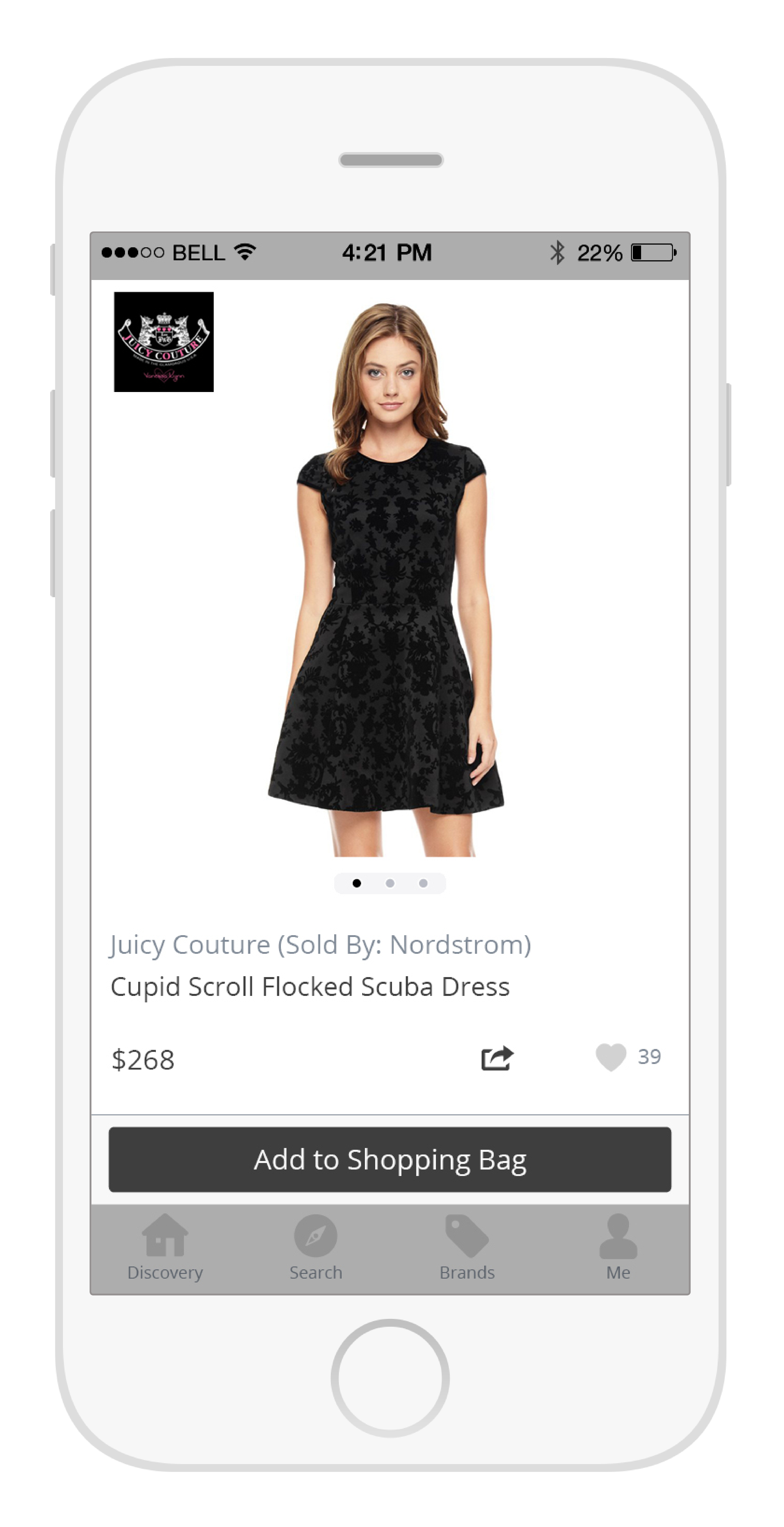
Product Detail
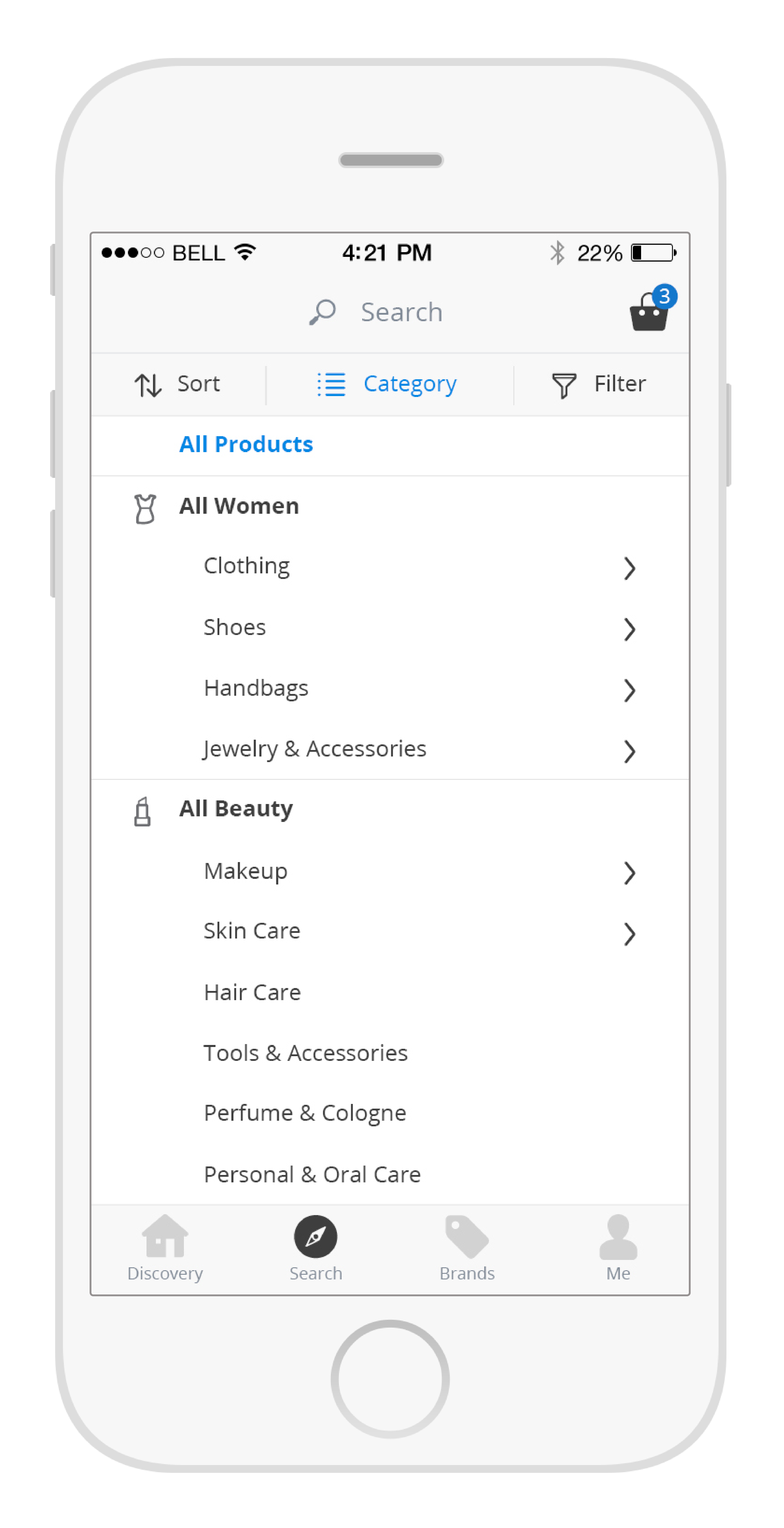
Filter by Category
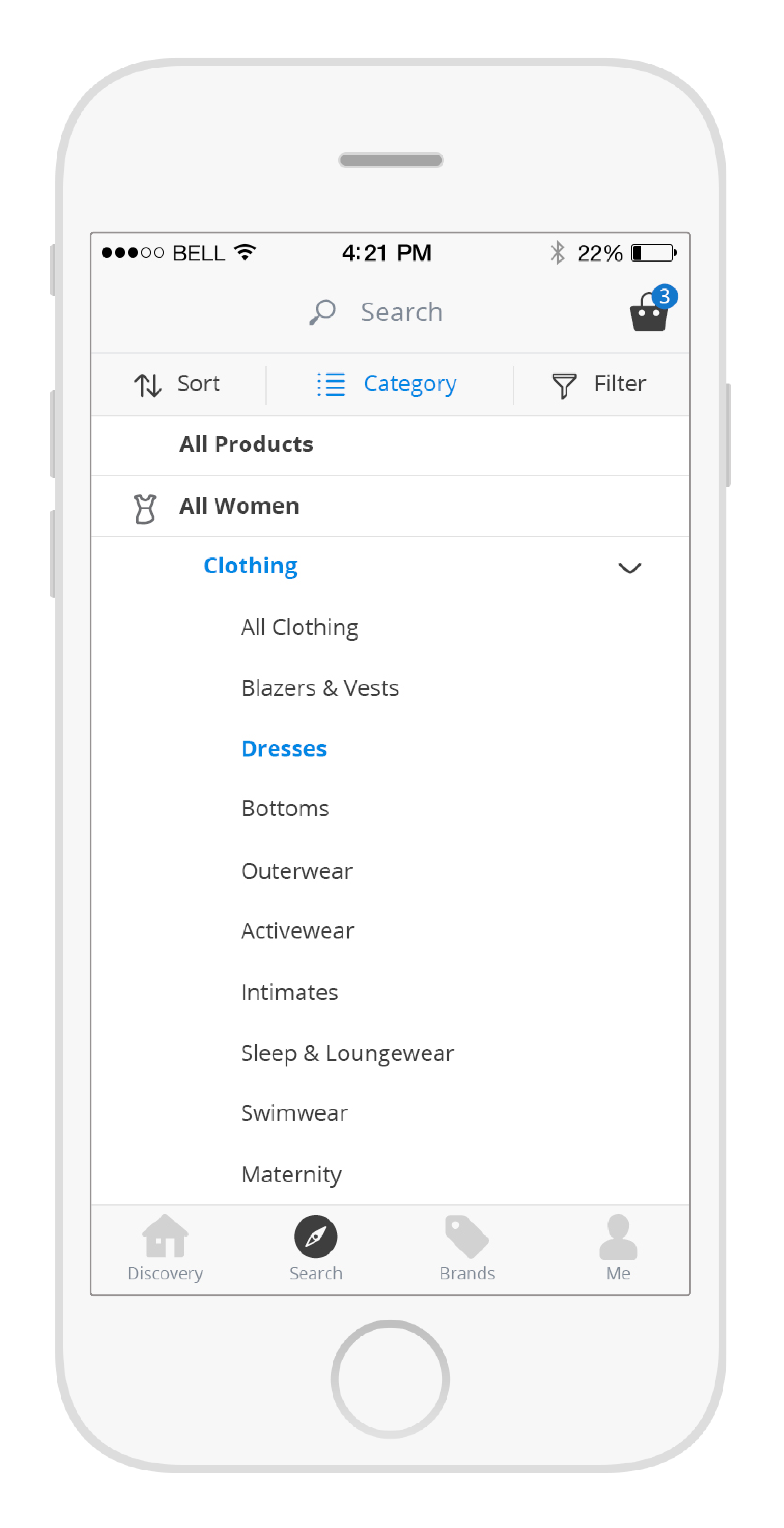
Filter by Category - Expanded
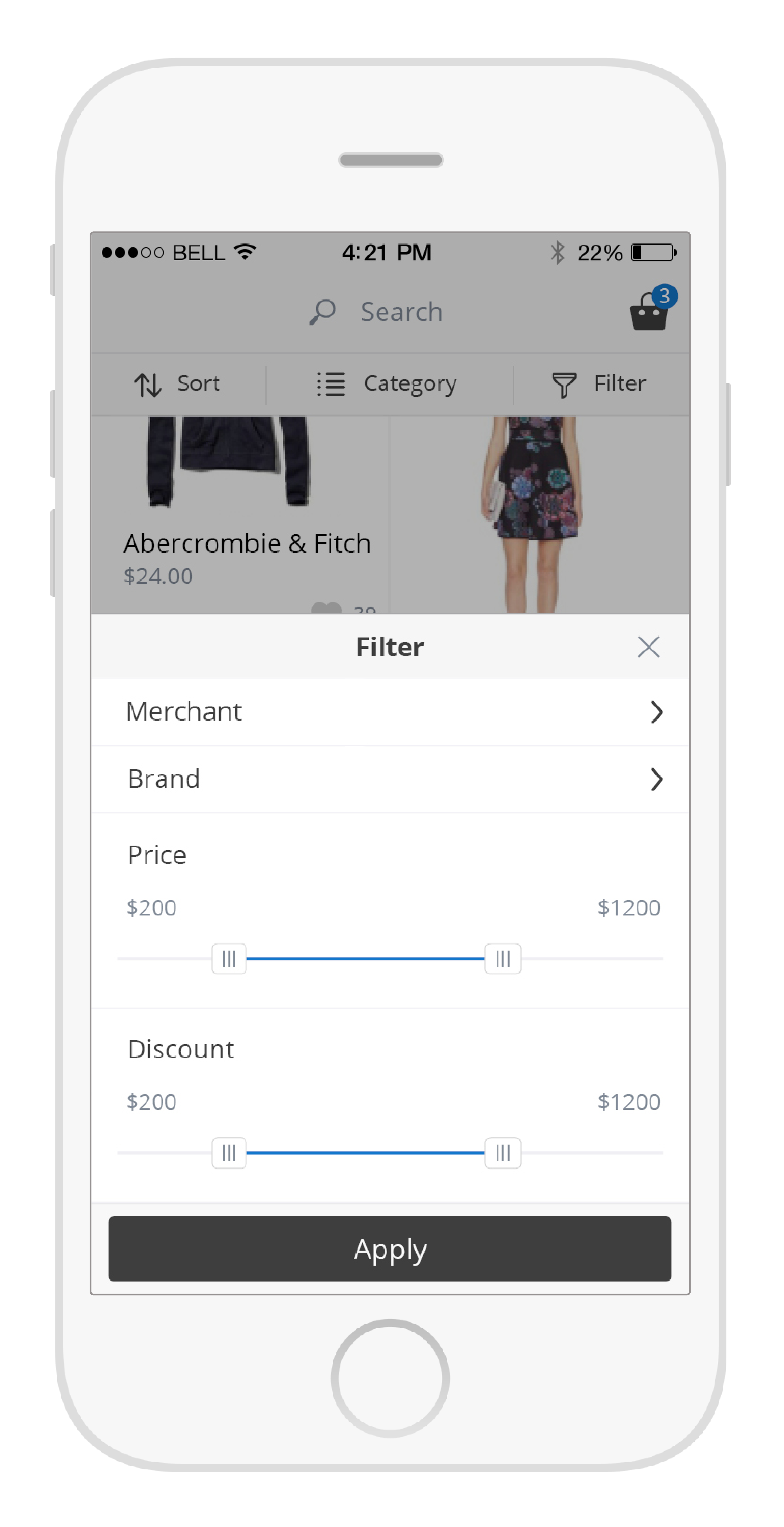
Filter
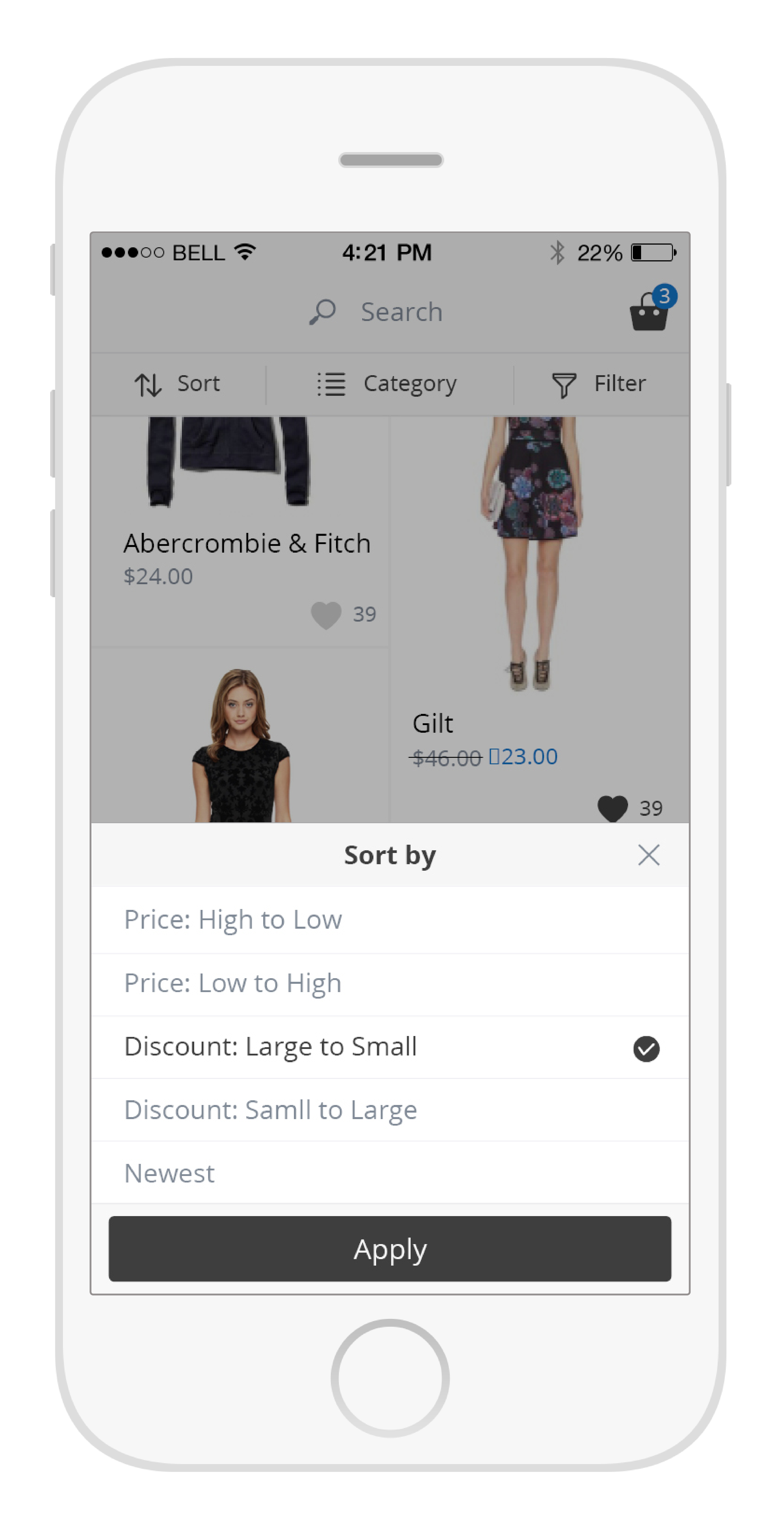
Sort by
Users tend to switch back and forth frequently between item list and items�?detail page while doing shopping on mobile. However, in most Apps, the ‘back�?button in the detail page is located on the top left corner, which makes it very difficult to reach. Also jumping between different pages is not a very smooth user experience. To solve those two problems, I came up with the UI for one-handed use. Once user clicks any item, the picture will be enlarged to take the same space as a regular page. The tab bar and navigation bar will move away, but the top and bottom of the category page is still visible and dimed as the background. To close the detail page, users can simply tap anywhere on the bottom part. The animation and layout make the user feel he/she can navigate without leaving the category page. The intuitive interaction makes the switching much easier and faster. If you are interested in the Mobile UI for One-handed Use, you can find more information in the blog - Mobile UI for One-handed Use
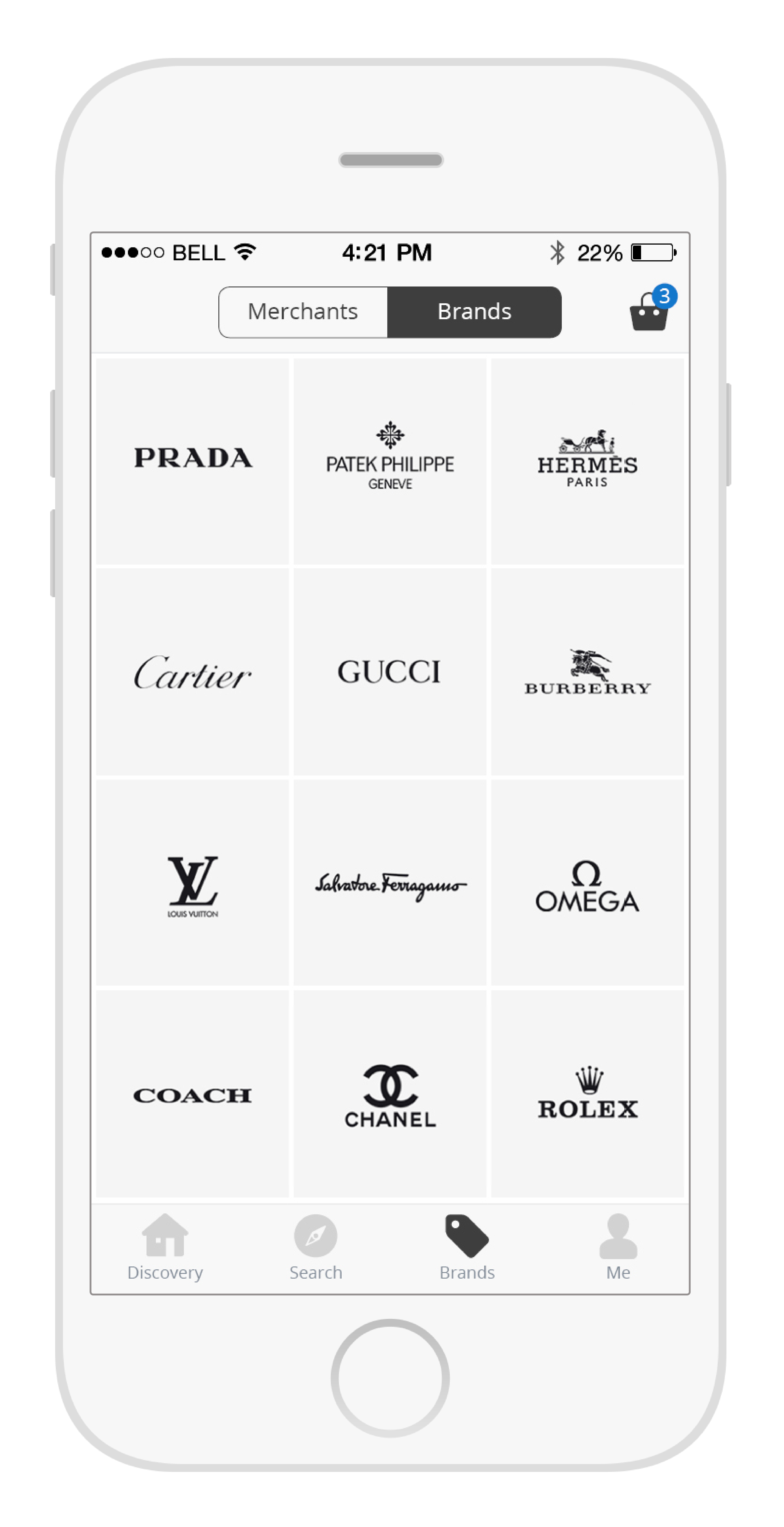
Brands tab includes Merchants and Brands. Here users can view all the products from their favorite merchants or brands by clicking the logos. We integrated only limited number of merchants, so I can prepare consistent logos for each of them. But we have hundreds of brands, which is hard for me to find all of the logos. The solution is to list several popular brands taking the full screen and when users scroll up, the full brand list will move up from the bottom to cover the brand logos.
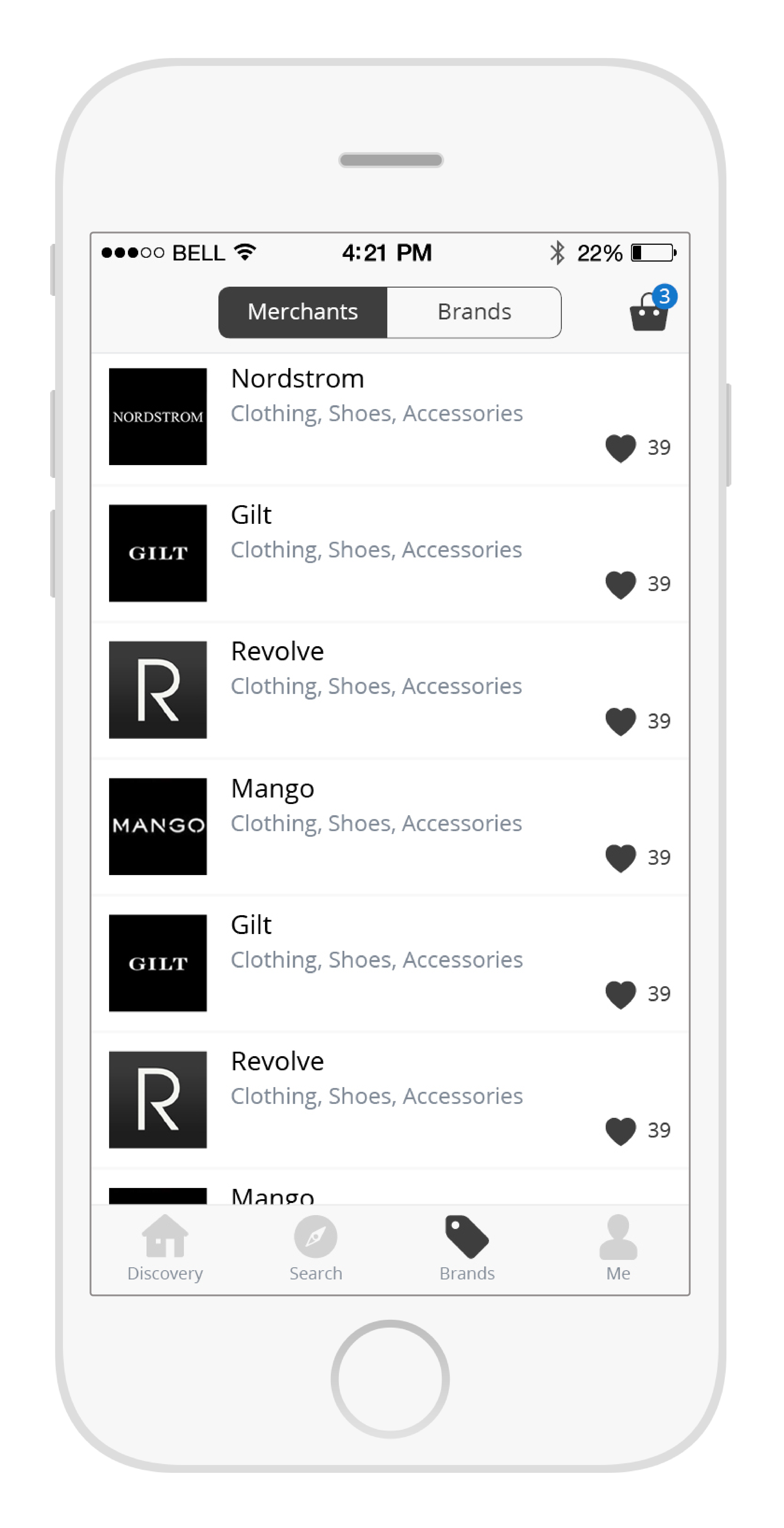
Merchants
Brands
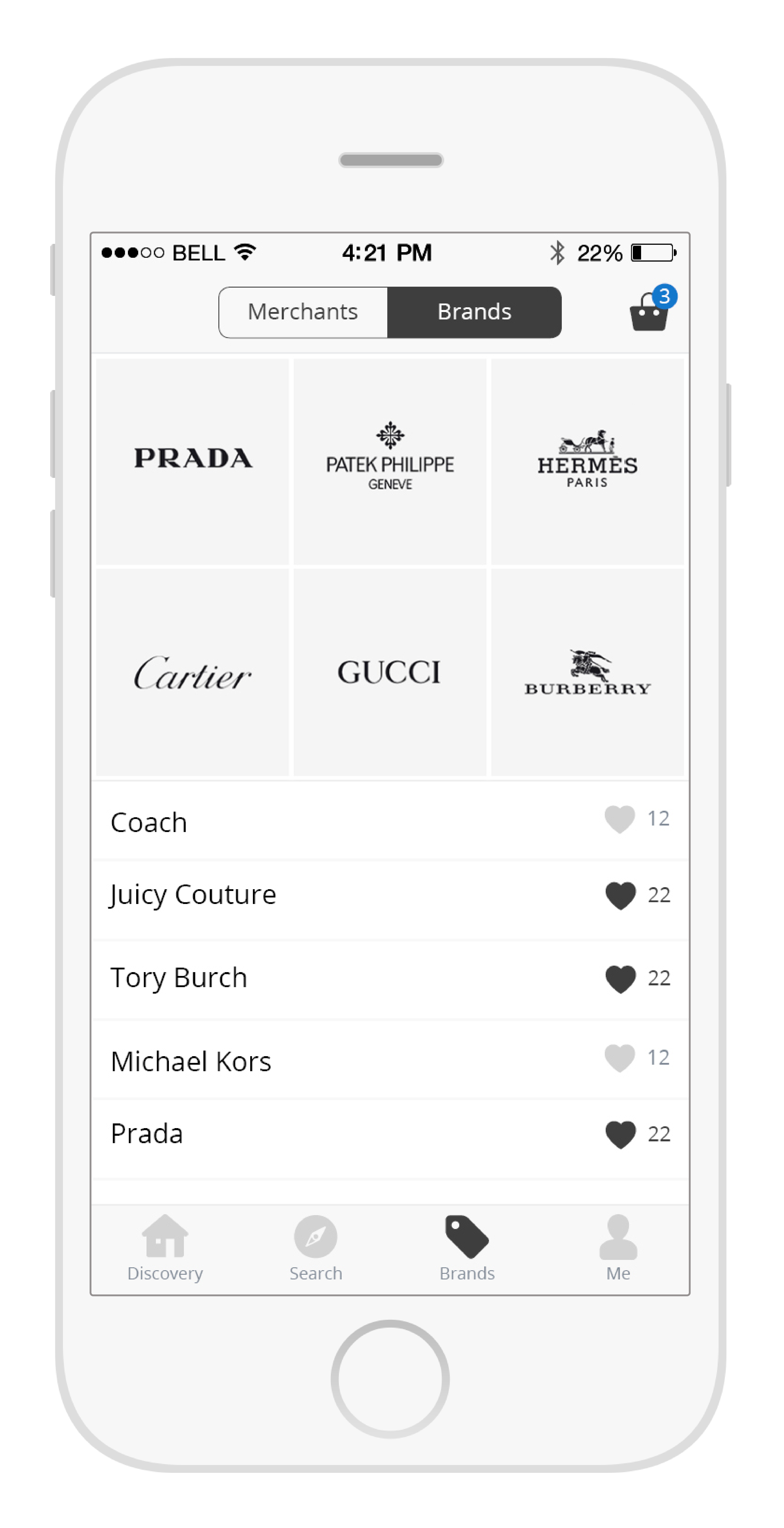
Brands - when scrolling up
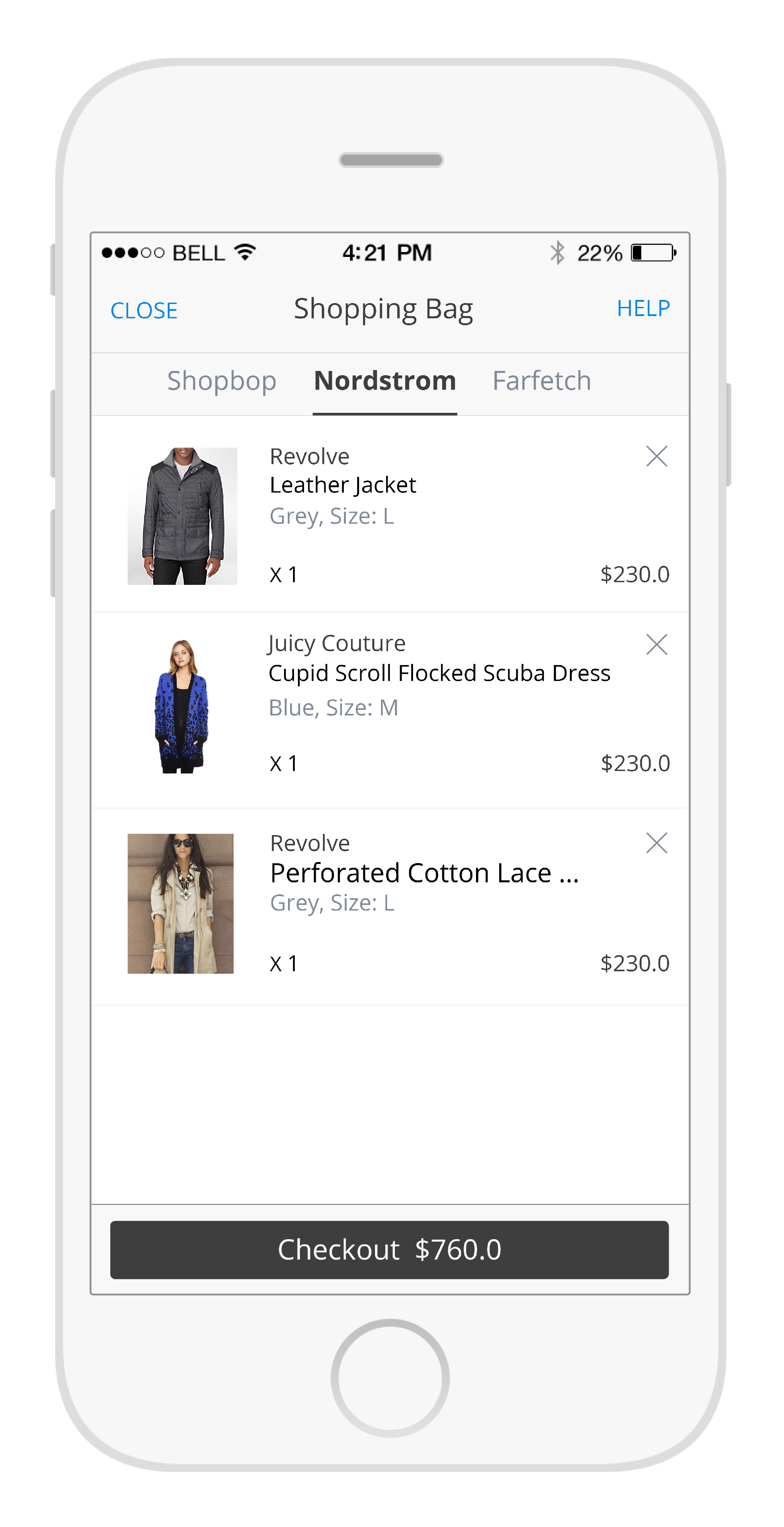
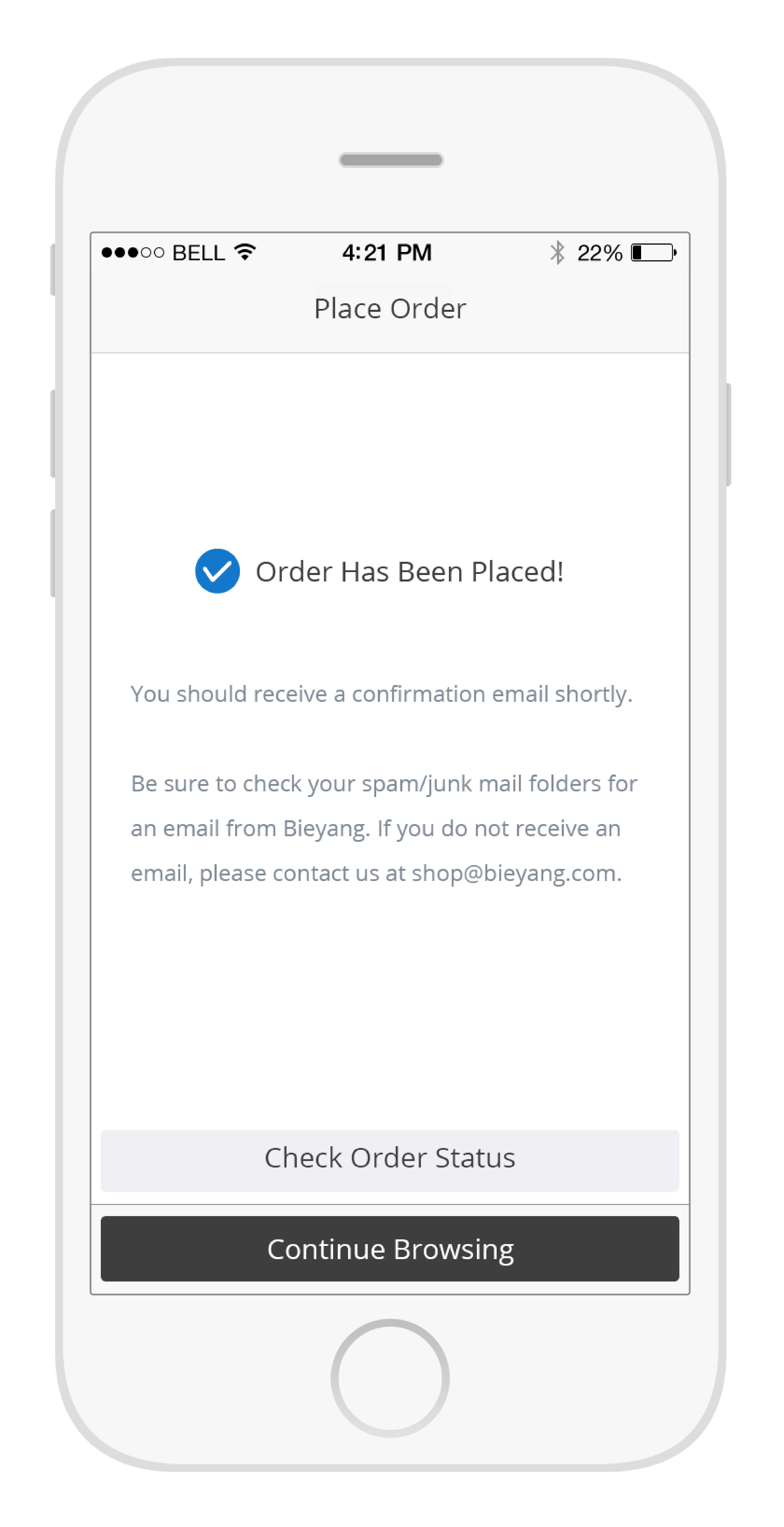
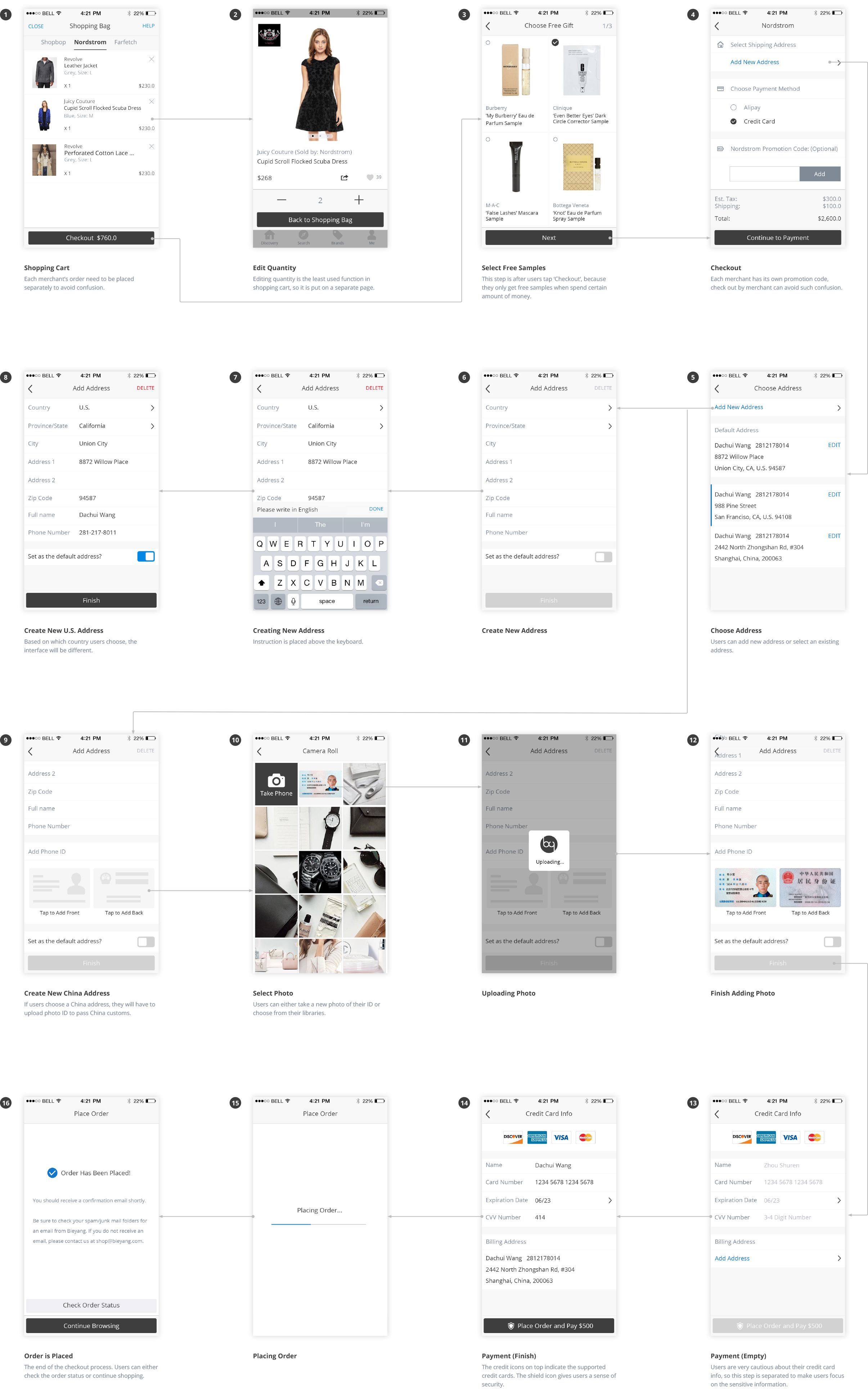
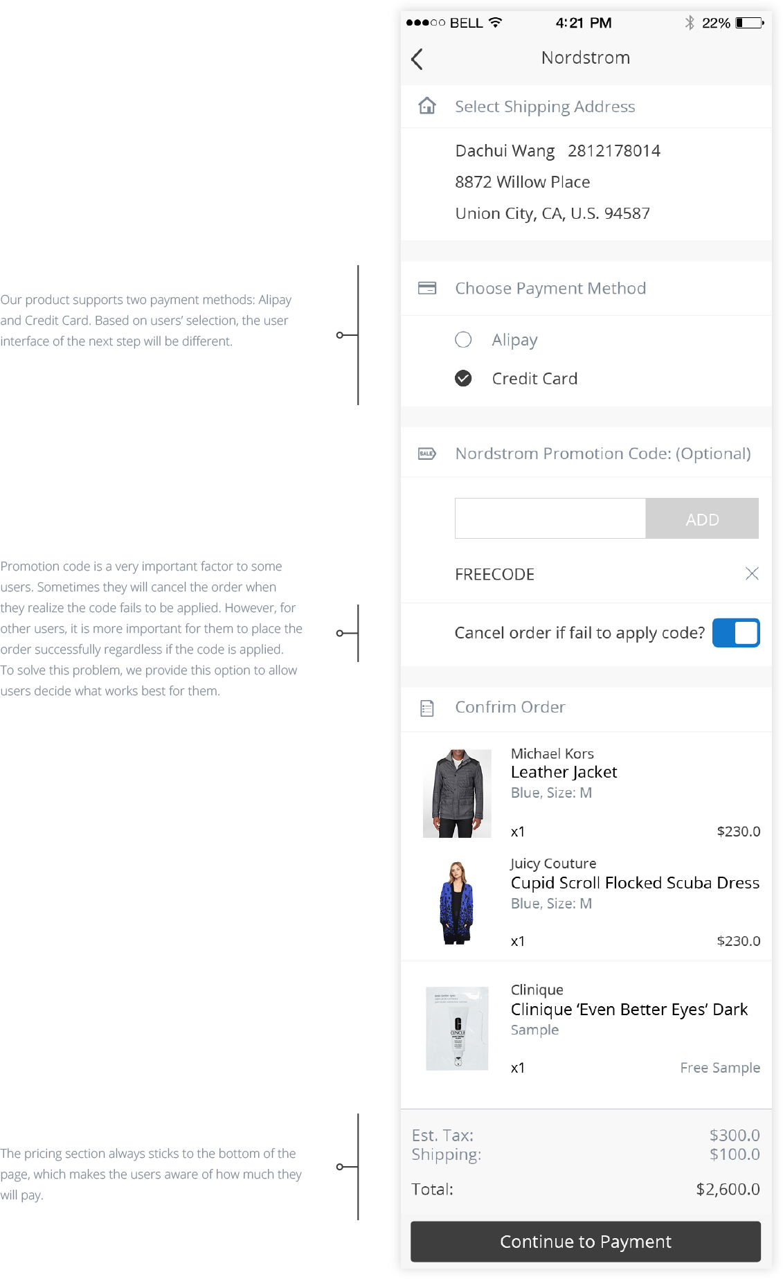
Checkout is the most complicated process for a shopping app. Since we support multiple merchants checkout, this adds another layer of complication. Considering the free samples, promo code and several other potential checkout problems, we separated the checkout process of each merchant. We only allow users checking out one merchant at a time to avoid any confusion. If you want to know more about the design process, there is a seperated blog post about the shopping bag design: Shopping Cart UI Design
Shopping Bag
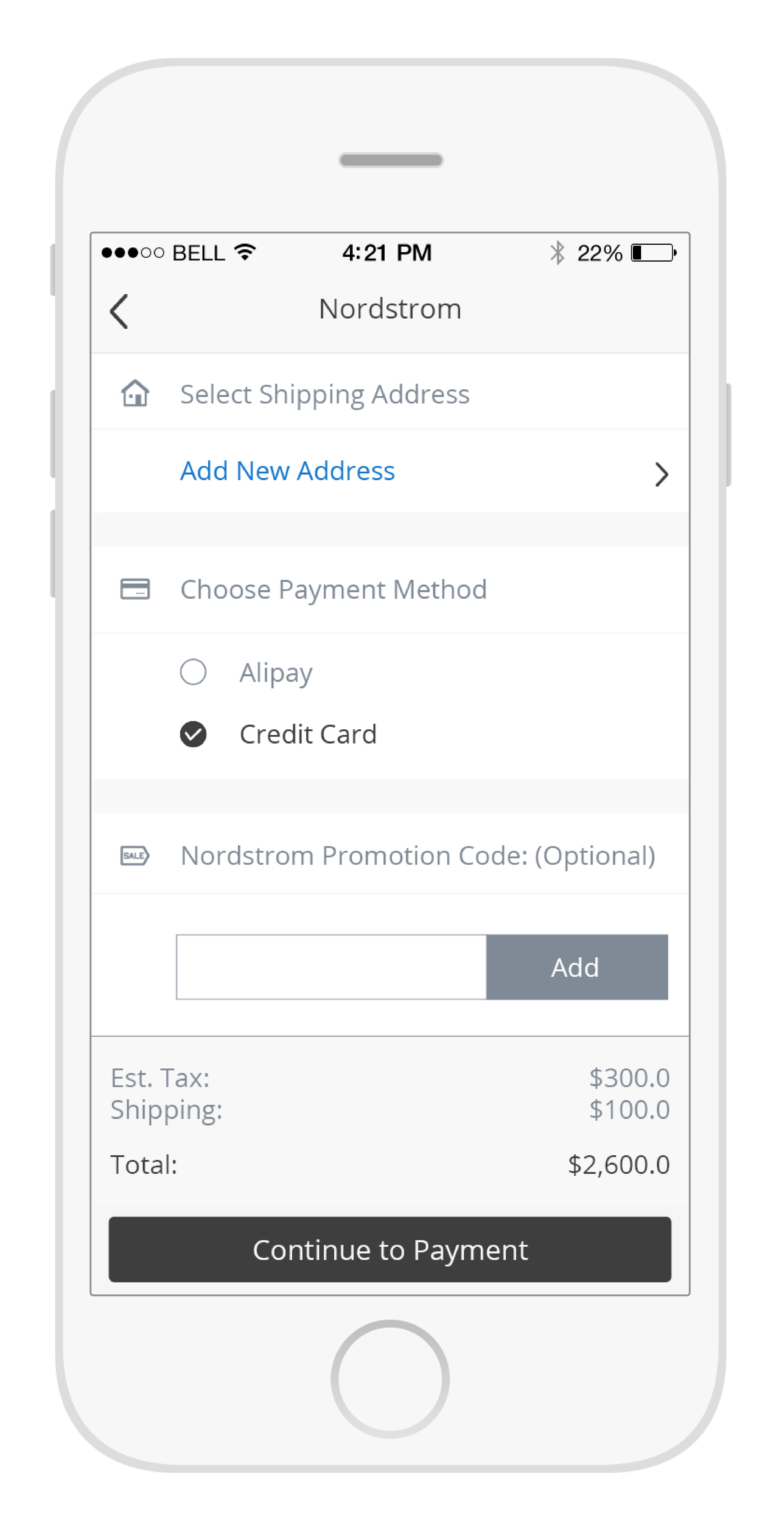
Checkout
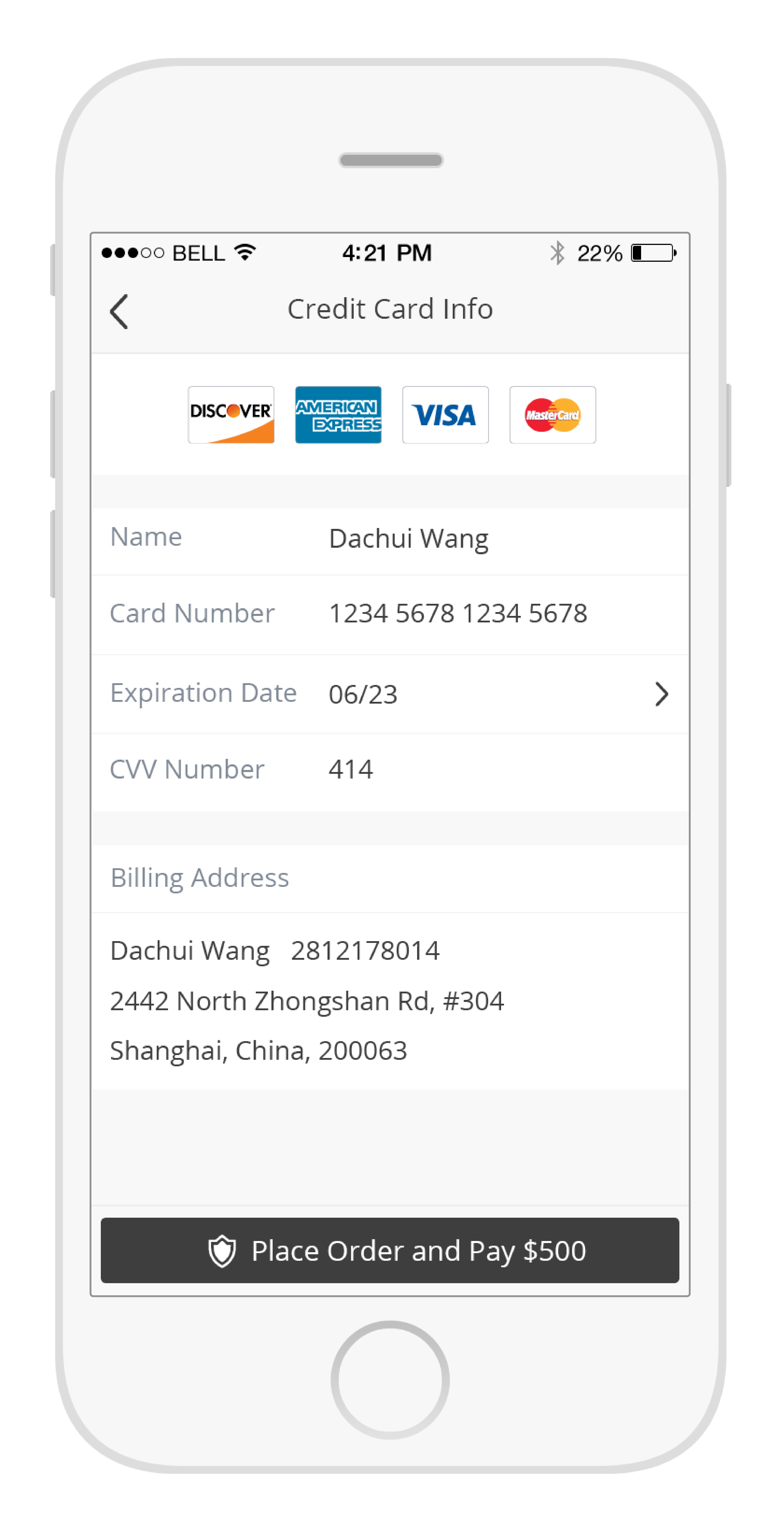
Payment
Confirmation
Each order is separated by merchant. For every order, we provide item-level tracking because merchants sometimes ship items in separated packages with separated tracking number even all items are purchased within one order.
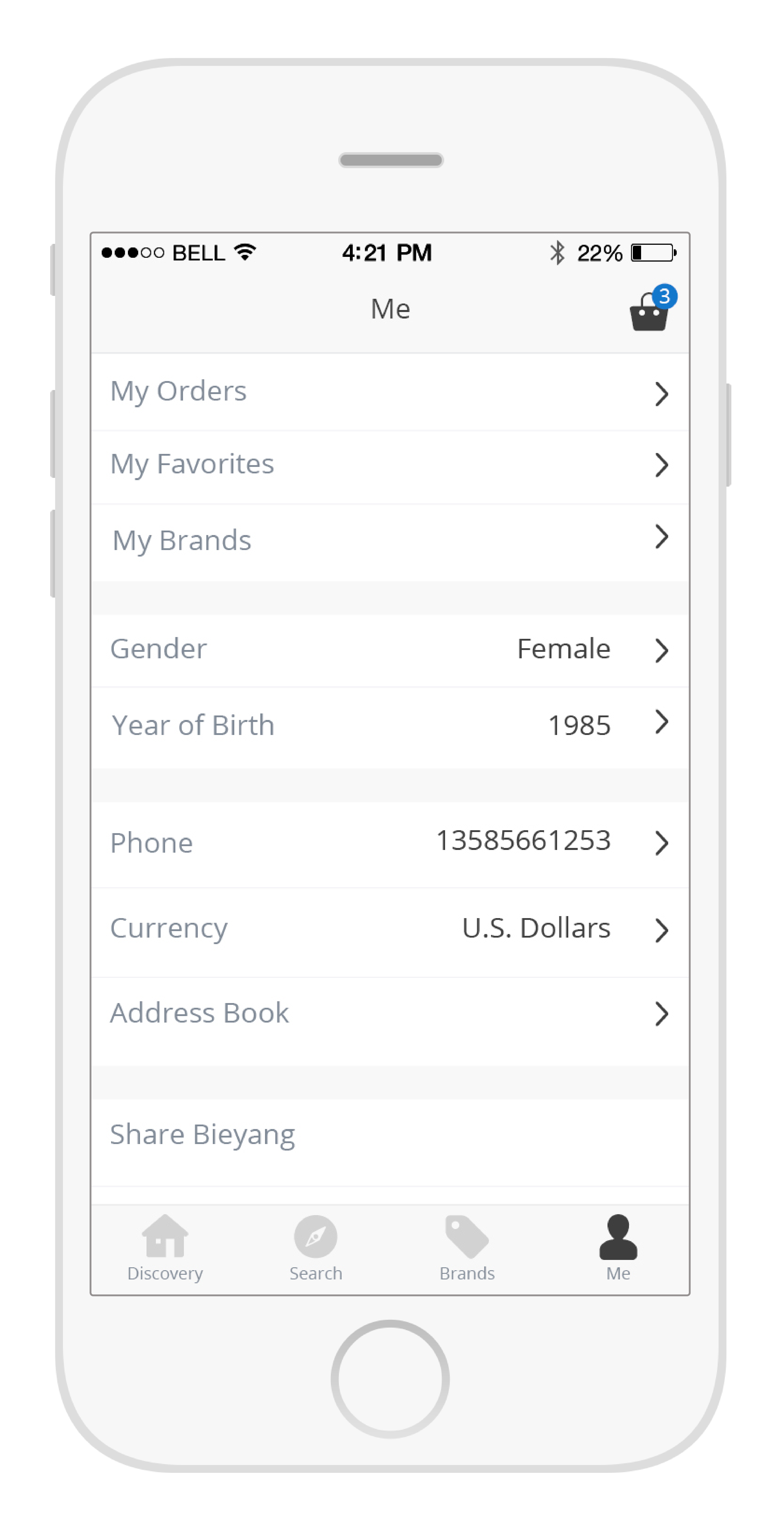
Me
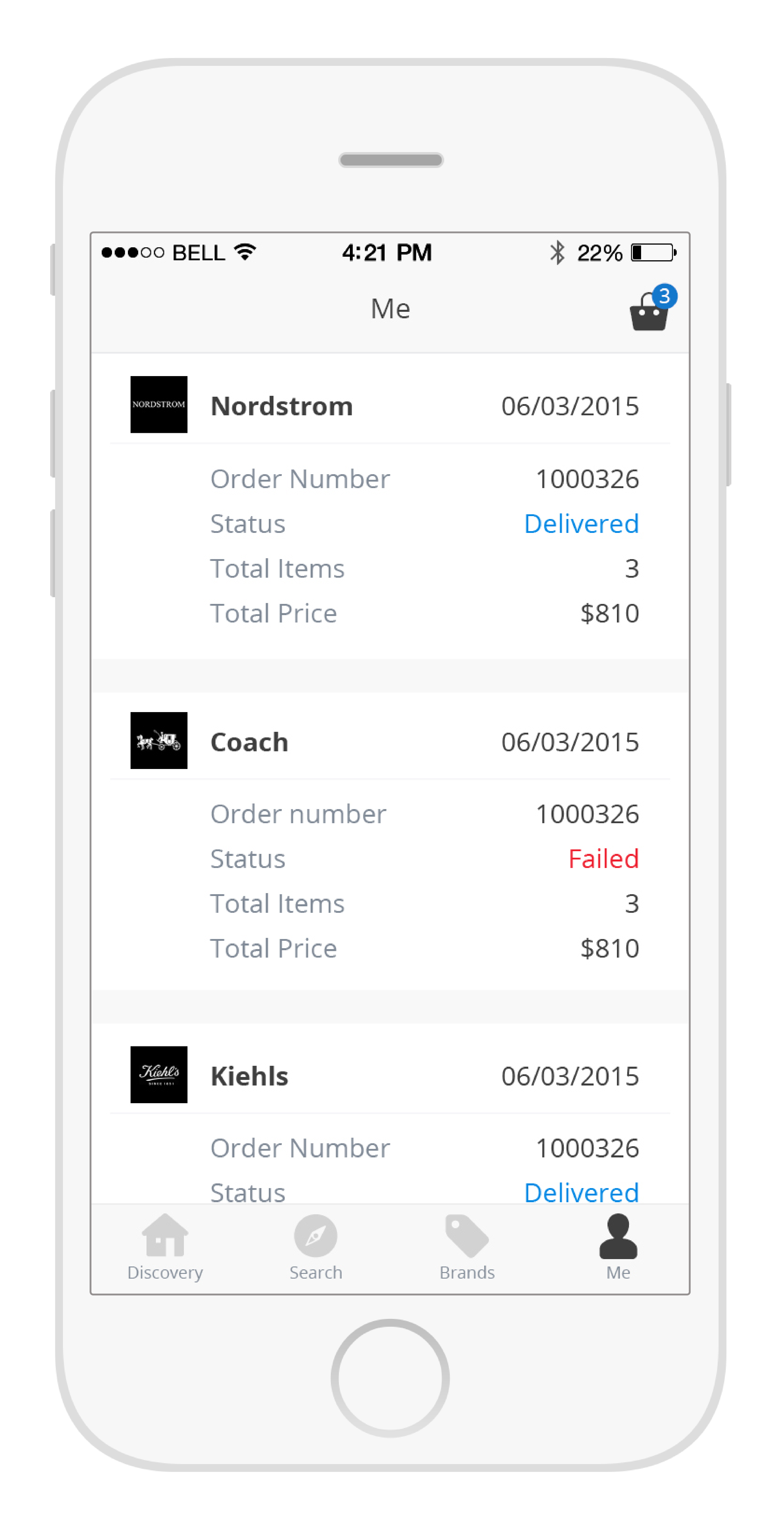
Order List
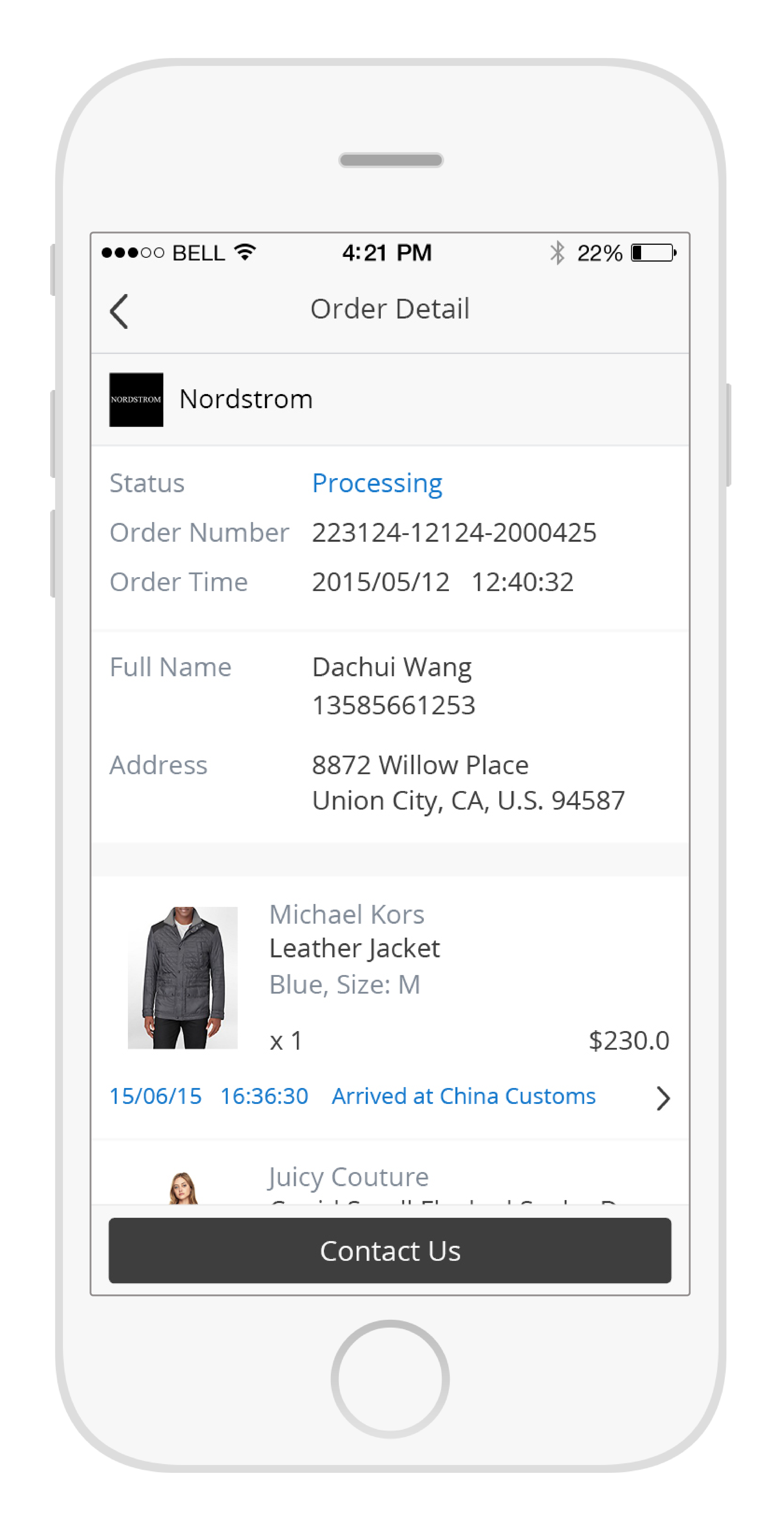
Order Detail
Tracking Detail