A Study of Advanced Searching and Filtering
‚ÄėMy Object‚Ä?is a new feature we recently added to the Striim‚Äôs platform. It is essentially a list of different types of objects. However, the challenging part is the design of the filter and search functionality. During the process, I came up with 3 different options and it is quite interesting to see how the design evolved.
Option 1
Option 2
Option 3
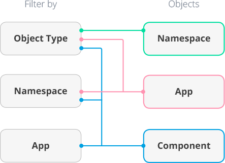
Before I start to design anything, the first thing I do is to extract all the related objects and study their relationship and properties. At Striim, there are 3 types of objects: Namespace, App and Components. ‚ÄėNamespace‚Ä?acts like a folder used to organize ‚ÄėApps‚Ä?and ‚ÄėComponent‚Ä? which can only be filtered by ‚ÄėObject Type‚Ä? ‚ÄėApp‚Ä?is a data pipeline that consists of different ‚ÄėComponents‚Ä? It can be filtered by both ‚ÄėObject Type ‚Ä?and ‚ÄėNamespace‚Ä? There are 7 types of ‚ÄėComponents‚Ä? Source, Cache, Window, CQ, WactionStore, Alert and Type. All ‚ÄėComponents‚Ä?can be filtered by ‚ÄėObject Type‚Ä? ‚ÄėNamespace‚Ä?or ‚ÄėApp‚Ä?
To measure the functionality of the design, I created 3 user tasks from simple to complex: Single filter: Show all the Caches with the keyword ‚Äėmerchant‚Ä? Multiple filters: Show all the Caches under ‚ÄėmyNameSpace‚Ä?with the keyword ‚Äėmerchant‚Ä? Multiple criteria: Show all the Caches under ‚ÄėmyNameSpace‚Ä?with the keyword ‚Äėmerchant‚Ä?and all the Sources under any Namespace.
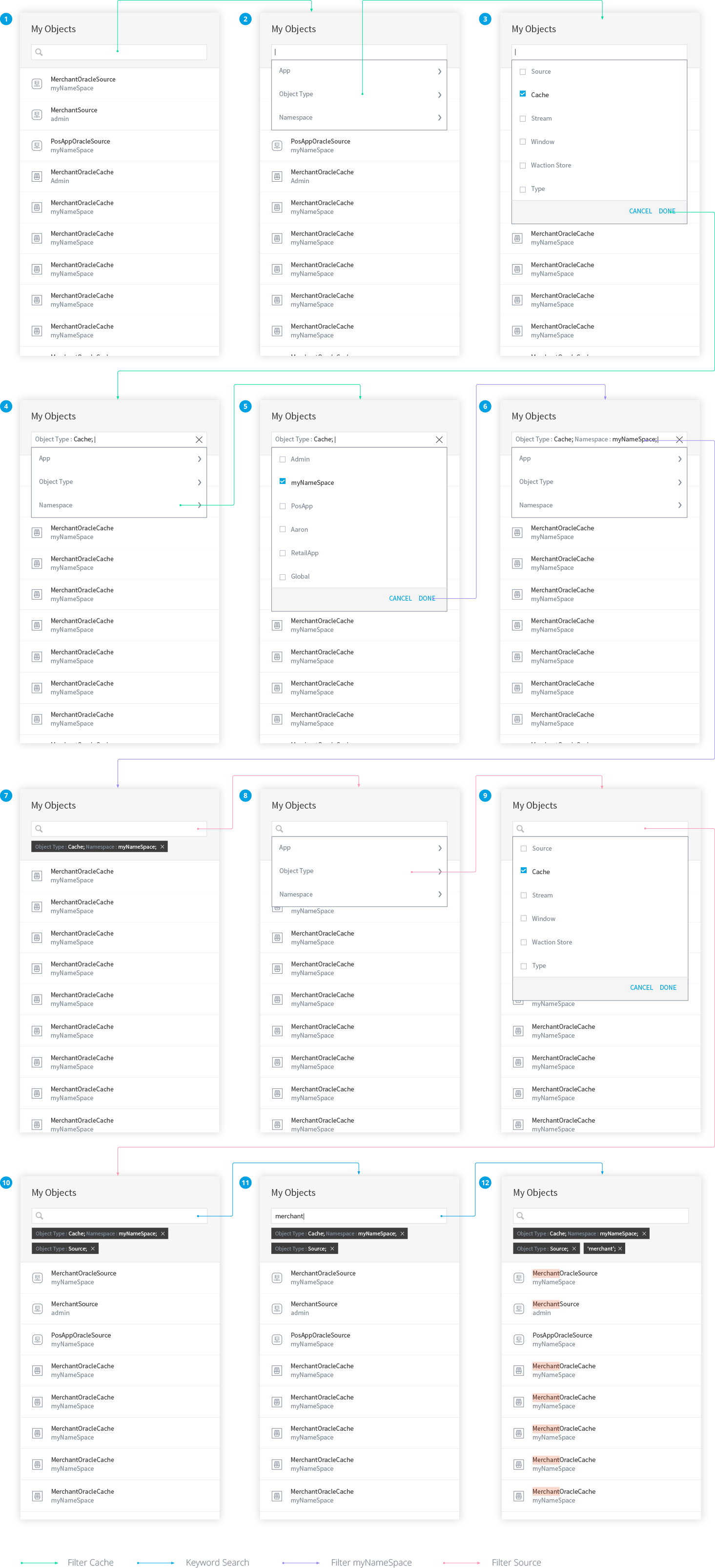
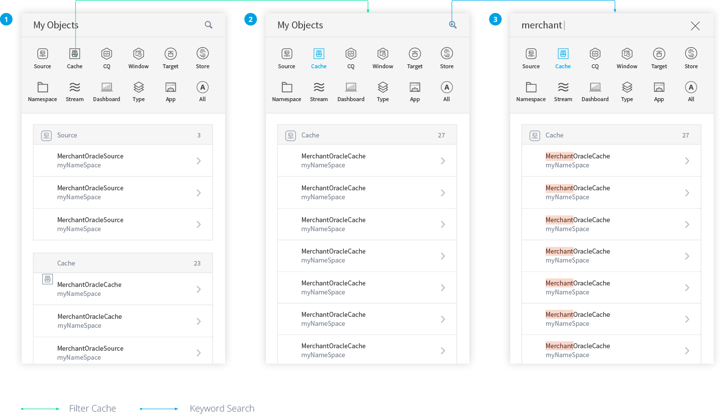
Option 1: Single filter
Since the ‚ÄėObject Type‚Ä?is the only filter that can be applied to all objects, the idea of Option 1 is to emphasize this filter and make it really easy to use. So I lists all the object types on top, which allows users quickly filtering any object type by one simple click. But this design is limited to single filter and users can‚Äôt filter objects by ‚ÄėNamespace‚Ä?or ‚ÄėApp‚Ä?
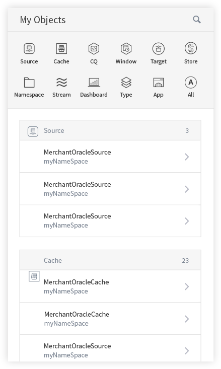
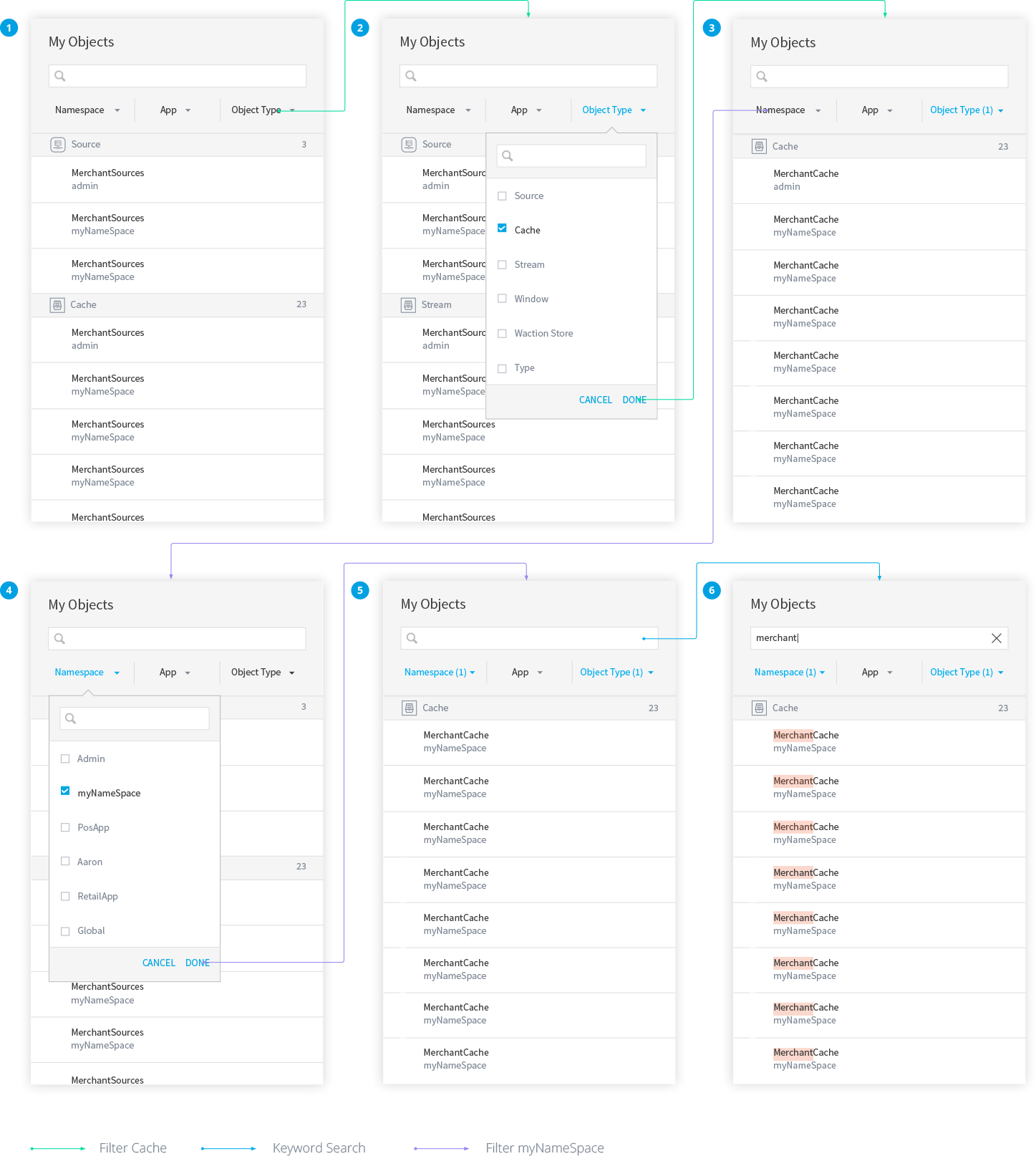
Option 2: Multiple filters
In Option 2, I replaced those object icons with 3 filter buttons below the search box. Users can create multiple filters by clicking any button and multi-select the options in the dropdown list. However, this design still has 2 major problems. The first one is those filters are all in ‚ÄėAND‚Ä?relation, so there is no way to do something like ‚ÄúShow all the Caches under ‚ÄėmyNameSpace‚Ä?and all the Sources under any Namespace‚Ä? The second problem is the interface only shows the number of the applied filters.
Option 3: Multiple criteria
Filter with multiple criteria requires complicated interactions. What Option 2 does is merely a single criteria. To enable multiple-criteria filtering based on Option 2‚Äôs design logic, I will have to provide an ‚ÄėAdd‚Ä?button somewhere and ask users to repeat the flow every time they add a new criteria. The process works but the problem is those filters can potentially take a big chunk of space and users will see less objects in the list. To solve the problem, I integrated the filter with the search bar. (If you think about it, search is actually a type of filter, so it makes perfect sense to put them together!) When users click the search bar, a drop down will list 3 categories of filter and then users can follow the similar process in Option 2 to keep adding more ‚ÄėAND‚Ä?filters until they hit ‚ÄėEnter‚Ä? which will end the current criteria and put it under the search bar. Users can add more ‚ÄėOR‚Ä?criteria by repeating the previous process. Compared with the other 2 options, Option 3 solves the most complicated problem with the simplest UI - a search bar.